

A Point About Points
21 Apr 2017Point or Line?
The City of Cape Town on 27 February 2017 released a list of the top 100 water consumers in the city. Cape Town lies in a water-scarce region and is (Q1, 2017) in the grip of a severe drought. Among other measures like water usage restrictions, part of mitigating the water crisis in the city was the publication of the list of ‘heavy users’ above. Several media houses ran with the story (and list) with some including a points map of these water users’ streets.
The top water wasters were named by street name and not street address.The ‘offenders’ points maps (I’ve come across) serve an excellent purpose in pinpointing the location of the subject street. A point however, gives the impression of ‘on-this-spot’.There is also as attribute of the point, the subject street name to aid the map user. Still a point map exposes our species of gazers to misinterpretation. The camouflaged water users cannot be quickly and easily identified via some buffer of the points plotted but rather by buffering the entire ‘offenders’ street. The offending household lives ‘along-this-street’ and not ‘around-this-point.’
Well, enough read? You can - Cut To The Chase
For The Love Of Eye-Candy
Well, I’ve learnt (and came to realise it too) that the value of spatial data decreases with the passage of time but, does good cartography follow the same trend? (discussion for another day). But for the love of better cartography I decided to come up with an improved version of the Top 100 Water Users Map.
Get The List
I got the list from the News24 Wesbsite. From the way it was formatted, I quickly concluded this would be a good candidate for CSVs. 100 lines in Notepad++ is not a lot to manipulate and format.
Make It Geo
Address geocoding used to be a costly and rigorous process. Nowadays there are several options to turn address descriptions to vector data. QGIS has the GeoCode option with the MMQGIS ‘Plugin’. Since I had determined to have the data visualised in CARTO, I moved the streets data to there for address geocoding. In seconds I had points!
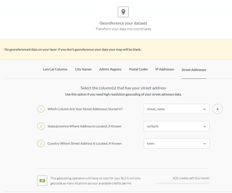
So in minutes I had the same Points Map as the media houses!
On inspecting the point data - Look, Spatial Duplicates! This would slip the untrained eye when looking at text data, especially that sorted/ranked by consumption. This is where spatial representation shines. The following duplicates(street wise) were found;
89.Hofmeyr Street‚ Welgemoed - 143 000 litres
94.Hofmeyr Street‚ Welgemoed - 123 000 litres
4.Upper Hillwood Road‚ Bishop’s Court - 554 000 litres
71.Upper Hillwood Road‚ Bishop’s Court - 201 000 litres
23.Deauville Avenue‚ Fresnaye - 334 000 litres
29.Deauville Avenue‚ Fresnaye - 310 000 litres
100.Deauville Avenue‚ Fresnaye - 116 000 litres
69.Sunset Avenue‚ Llandudno - 204 000 litres
95.Sunset Avenue‚ Llandudno - 122 000 litres
46.Bishop’s Court Drive‚ Bishop’s Court - 236 000 litres
97.Bishop’s Court Drive‚ Bishop’s Court - 119 000 litres
This ‘repeat’ of a street name changes the way the data would be represented. For Hofmeyr Street for instance, the combined consumption would be 266 000 litres. Since consumption is presented by street name.(At the back of our minds cognisant of the fact that the data was presented by street to mask individual street addresses. )
The geocoding in CARTO was also not 100% (would say 95% accurate). I had to move a few point to be exactly over the subject street in the suburb. Not CARTO’s geocoder’s fauly at all. My data was roughly formatted for a relly good geocode success hit.
Street = Line
Now to get my streets (spatial) data, I headed over to the City of Cape Town Open Data Portal. Road_centrelines.zip hordes the street vector data.
In CARTO I exported the points data, to be used to identify the street ‘line’ data.
Within QGIS, the next task was to select the subject streets, being guided by the points data. The (un)common spatial question:
Select all the streets (lines) near this point (having the same street name).
To answer the above question, a ‘Select by Attribute’ was done on the street geo-data. Formatting the expression with the 100 street names was done in a text editor (Notepad++) but the expression executed in QGIS. Some subject streets (e.g GOVAN MBEKI ROAD) spanned more than one suburb and these had to be clipped appropriately. Again I headed over to the City of Cape Town Open Data Portal to get the Suburbs spatial data (Official planning suburbs 2016.zip).
I used these to clip the road segments to the corresponding suburbs. I further merged small road sections to ease the process of assigning attributes from the point to the streets. A field to store the combined consumption for that street was also created.
A Buffer operation of the points data was done followed by a Join Attributes by Location operation to transfer attributes from the points to the line. An edit was made for the spatial duplicates to sum the consumption totals.
The streets vector data (lines) will not have Usage Position assigned to them. The data has been aggregated and totals for a street are now in use. This reduces the data count from 100 to 93 ( 6 repeats , 1 not found street).
Show It
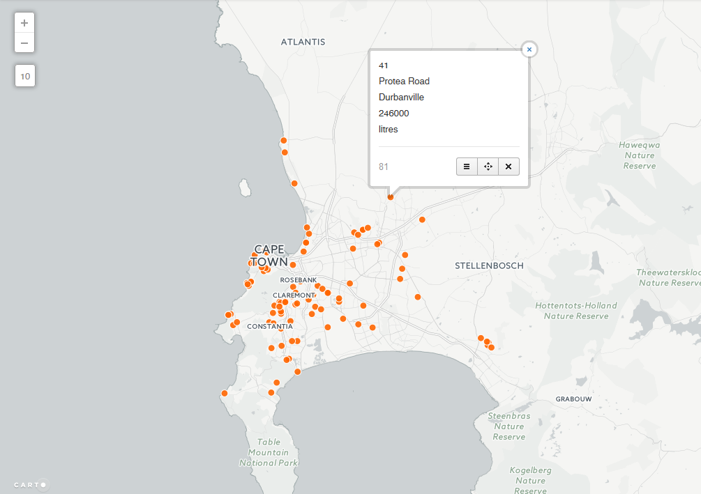
Back to CARTO, I imported the edited streets data for mapping and styling. Wizards in CARTO make mapping trivial for the user. The resultant map below -
I chose the Darkmatter background inorder to highlight the subject streets. A on-hover Info window option was chosen in keeping with the ‘gazing species’.
Perhaps Areas (Polygons) ?
I am somewhat satisfied with the way the data looks represented as lines (read - streets). Strong point being - a line forces one to scan its entire length. While with a point, it immediate vicinity. There’s still some discontentment with the way the lines look - ‘dirtyish’, but then that is the reality of the data. There are several flaws such a visualisation:
- The length of a subject street gives the impression of higher water usage.(Colour coding of the legend attempts to address that.)
- Chances are high a would be user associates the ‘lines’ with water pipes.
- On first sight, the map doesn’t ‘say’ intuitively what’s going on.
This leads me to Part B - “Maybe it’s better to have property boundaries along the street mapped for the water usage”.
#postscript
- Good luck finding Carbenet Way‚ Tokai! (Looks like a data hole to me.)
- With the data wrangling bit, street names such as FISHERMAN’S BEND were problematic dealing with the 's
- CCT open data portal could imporove on the way data is downloaded. Preserving the downloaded filename for instance and other things.