28 Jun 2025
At the end of week 1 (Week 2 actually), my enthusiasm about the course is still the same, if not more. Most exciting was writing code in the Visual Studio Code IDE, which I quickly customised to a dark mode theme! The course content reached deep into my long term memory, as concepts I learnt years ago, via a self-paced study through Sams Teach Yourself C in 21 Days, surfaced and got reinforced. I watched all the Shots and Section video which gave solid learning to solving Problem Set 1.
Fundamentals & C
The C Programming Language is introduced gently in the lecture video and a consistent comparison with Scratch made the transition very easy. Steadily the lecturer goes into depth with the language, without any sharp curves though. One key concept that I understood better this time, which I couldn’t wrap my head around when I first learned C, was Function Prototyping.
The command line (CLI) was covered foundationally as the lecturer demo’ed code. There is a Shots that goes into detail on the subject on Week 1 recommended material. Having dabbled with Linux, at one time attempting a collection of distros that could fit on a 1.44MB Floppy disk, to spinning a PosgreSQL instance on Digital Ocean inorder to toil with PostGIS. I know better that hands-on is the best way to take when it comes to the Command Line.
Measuring Grit with Problem Set 1
Following recommendations from the web, I decided to use only the course material to maintain focus. So far they have really proved to be sufficient to equip one to tackle the Problem Set.
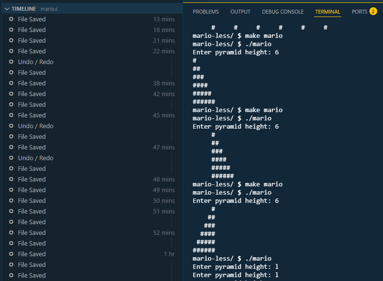
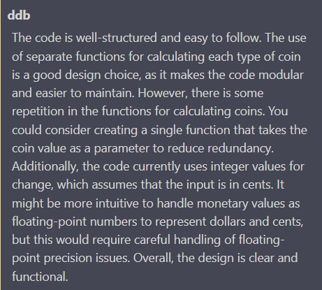
The partial screen capture above was the beginning of an exhilarating experience of coding. While following a live (pre-recorded) coding session, the Section Video, I demonstrated grit, pausing the video and getting the solution myself first before revealing the Preceptor’s approach. I learnt to analyse code and comprehending what the program was doing through unintended consequence/ output. I took my first shot using ddb (duckdebugger) to better understand the loops I was using to implement a solution.
Through pure grit I solved the second of Problem Set 1 , going through the code, iterating and learning from unintended consequence. I stuck to the coding screen as I knew the solution was not far, I was just not getting something/ quite understanding what the code was doing. Albeit gently, my Computation Thinking is developing.
It was a satisfying experience to finally see the output as expected, a right justified pyramid!
Reflections
-
This week I quickly realised more time needs to be committed to study to allow for tangential learning and deep dives in some areas.
-
I learnt that you don’t have to get the solution at first go, at least as a beginner. Having walked from a problem for a few minutes …only to return with a clear mind which presented the solution as obvious, without rubber ducking.
-
It helped that I have some programming experience, I would have needed more time to ‘get it’ on the theory part.
-
Even though code compiles and executes, through use of CS50’s Design50 tool, it became apparent there was room for better design, one of the three, CORRECTNESS - DESIGN - STYLE, areas to give attention to when coding as learnt in the lecture.
Onward to Week 2…potentially revisiting this week’s submissions for better design.
23 Jun 2025
The first lecture of almost 2 hours by Professor David J. Malan was fascinating. Took me some time to adjust to how fast the Prof. talks. I paused and replayed at a few places, to digest, for instance, “one can count up to 31 using a single hand’s fingers.” .The course’s aim is to teach one, Computational Thinking. That gave me a new mindset when looking at the course. I had several moments of refreshes to my knowledge of computer science topics like algorithms and functions. One huge takeaway was the concept of rubber ducking. Closing the lecture game playing on stage, was my namesake, Erick from Philadelphia. How coincidental!
Problem Set 0: Starting from Scratch
Problem set 0 was
to implement in Scratch, at scratch.mit.edu, any project of your choice
subject to some requirements. This caught me off guard a bit as I was expecting to solve a pre-determined problem. I eventually settled on an falling object avoidance game - Save Gobo.
Some takeaways I got from this challenge
- Not enough knowledge of the solution development environment (language) can be a barrier to a speed implementation of a solution.
I came to understand the need to read documentation to know what’s available and as to what a tool/ function does and what it is most useful for. Often I had to read-up/ review the lecture, to find out how to do achieve a particular objective.
-
As you keep iterating the solution, the approach to a particular goal changes, often improves.
-
Start with smaller blocks and then compound
The idea of working with smaller blocks/ simpler code had been brought up and recommended in the video lecture by Prof. Malan. As I progressed with my game development challenge, I saw my code grow and becoming a little complex each time.
A First Submission - Save Gobo
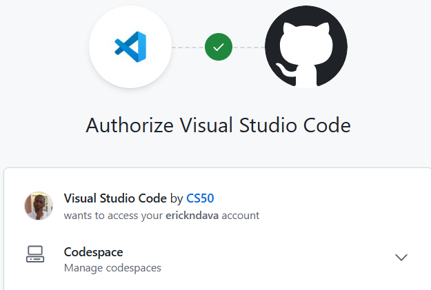
Although CS50 is introduced as an entry-level course and suitable for anyone without prior programming experience, it helped that I had a GitHub account. One is needed when submitting assignments and connecting with the learning platform EdX

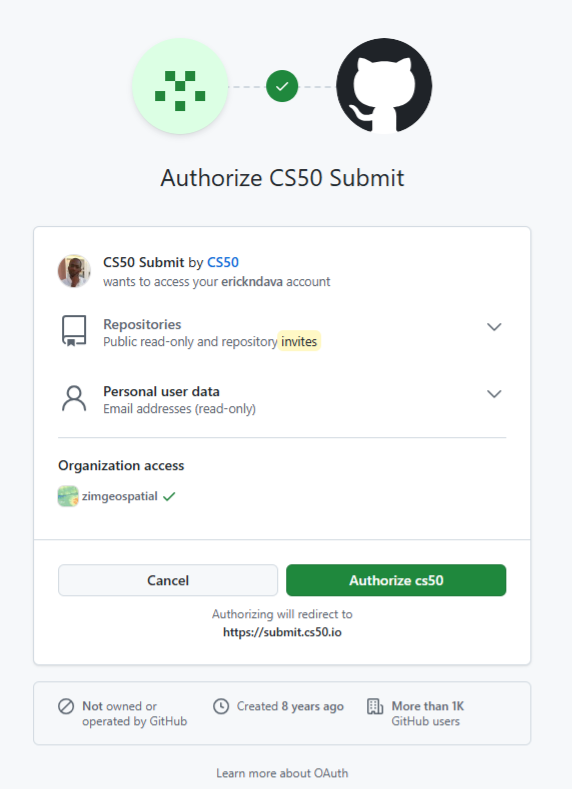
Authorise for the course gradebook
Authorise for submission
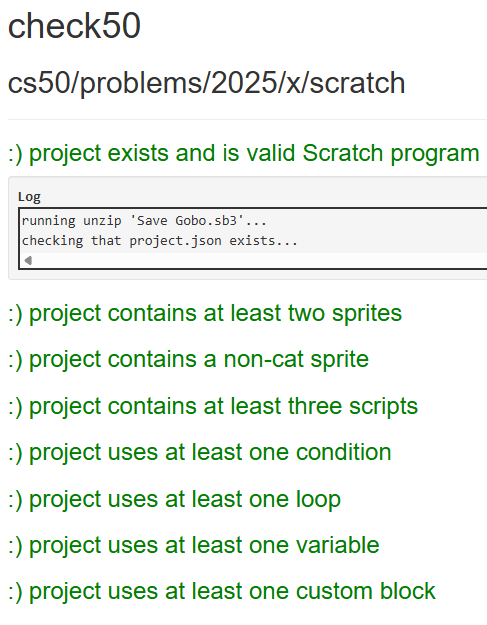
On submitting My Scratch Program, it was a satisfying experience to get 8/8 on this first submission. Confirming that my program met all the requirements per the assignment.
Reflections
The greatest challenge this week has been to find enough time for this course. Though I did week 0 in one week! As a family man and working professional that is expected. Going forward I need a more strict study routine as I foresee greater depth into topics as I move into Week 1.
15 Jun 2025
At the beginning of Q2 this year, I decided to pursue formal studies in data science. An online, self-paced course wasn’t motivating enough. I wanted something that has monitored learning and deadlines, with a deeper take of the the subject matter and having guardrails to spur me to finish. I looked around and found the PGDip in Industrial Engineering: Data Science at Stellenbosch University. It has a great delivery mode for working professionals and covers all the essential topics of data science according to the Curriculum.
Why Data Science Now?
Getting to a spatial analysis requires a great deal of data management and cleaning, I have had my share of that through my career. So, as part of my upskilling strategy I have been thinking about and working on :
strengthening my data analysis skills to become a Spatial Data Scientist, aiming to seat myself at the intersection of spatial data analysis and data science.
I self evaluated to check on some personal traits justifying why steer in that direction
-
I love combing through data and I appreciate a good data wrangle. Blogged a series sometime ago.
-
Pushed the boundaries of excel with 1 Million records - If that counts as Big Data.
-
While working with data, my aim has been to get to the spatial component and get cartographic output, giving other data elements scant attention. Now is the time to change that and prod the data more.
-
I have worked with many and large datasets before but, my approach has been largely, brute force, labour intensive and rudimentary. Through data science studies, I can leverage programmatic approaches to data wrangling.
Taking Havard’s CS50
One of the requirements of the PostGrad Diploma is studies in Computer programming. They also recommend, among other courses, taking Harvard’s CS50 to meet this requirement. I choose to take this route even though I have done CT130- Computer Science for Engineers. That was 25 years ago and the focus Language was Pascal. For my undergrad research project I delved in Visual Basic. Over the years though I also have dubbled in C, recently R. Some JavaScript and HTML in a Web Mapping Project. So computer code, I can understand fairly well and I can think programmatically to an extent.
Taking CS50, I aim to:
- Relearn Computer Science concept, bringing structure to the knowledge and skill I have acquired over time as a spatial scientist.
- Get a good grasp of Computer Science Concepts like, picking from memory, pointers in C.
- Have a fresh and solid base for when starting the PGDip studies
Documenting The Journey
I enjoy writing, so I will start a blog series designed to document my experience with Harvard’s CS50. In addition to completing the course and getting a certificate, this chronicle should hopefully also act as evidence/ motivation for use when applying for admission to the PGDip.
With the help of ChatGPT, I settled for a 12 week schedule to complete CS50, giving enough time to the application deadline. October 2025. Tomorrow I start!
07 Jun 2025
On the ‘5-9’ job I use ESRI software extensively. Over the course of my career I have invested time learning the ins and outs of the software from data capturing , editing to analysis. I set apart regular time to learn how to use the software. Efficiency and increase in productivity also depends on saving on the micro-seconds one spends doing things the inefficient way. So I poured through the HandsOn section of earlier editions of ArcUser’s, gaining much skill, self-training.
Fast forward to date, the organisation is making a switch from ArcMap to ArcGIS Pro because of ArcMap reaching end of life support. Pro has been around for some time now already and understandably, for large organisations making the switch has huge implications on production hence the somewhat ‘slow’ adoption of new technologies - Don’t quickly break what is working at the expense of service delivery. Now though, was the time to migrate.
I knew some advantages of Pro, but the internal resistance was stemming from the comfortable skill level in older software and from the change in software design philosophy from ArcMap to Pro.
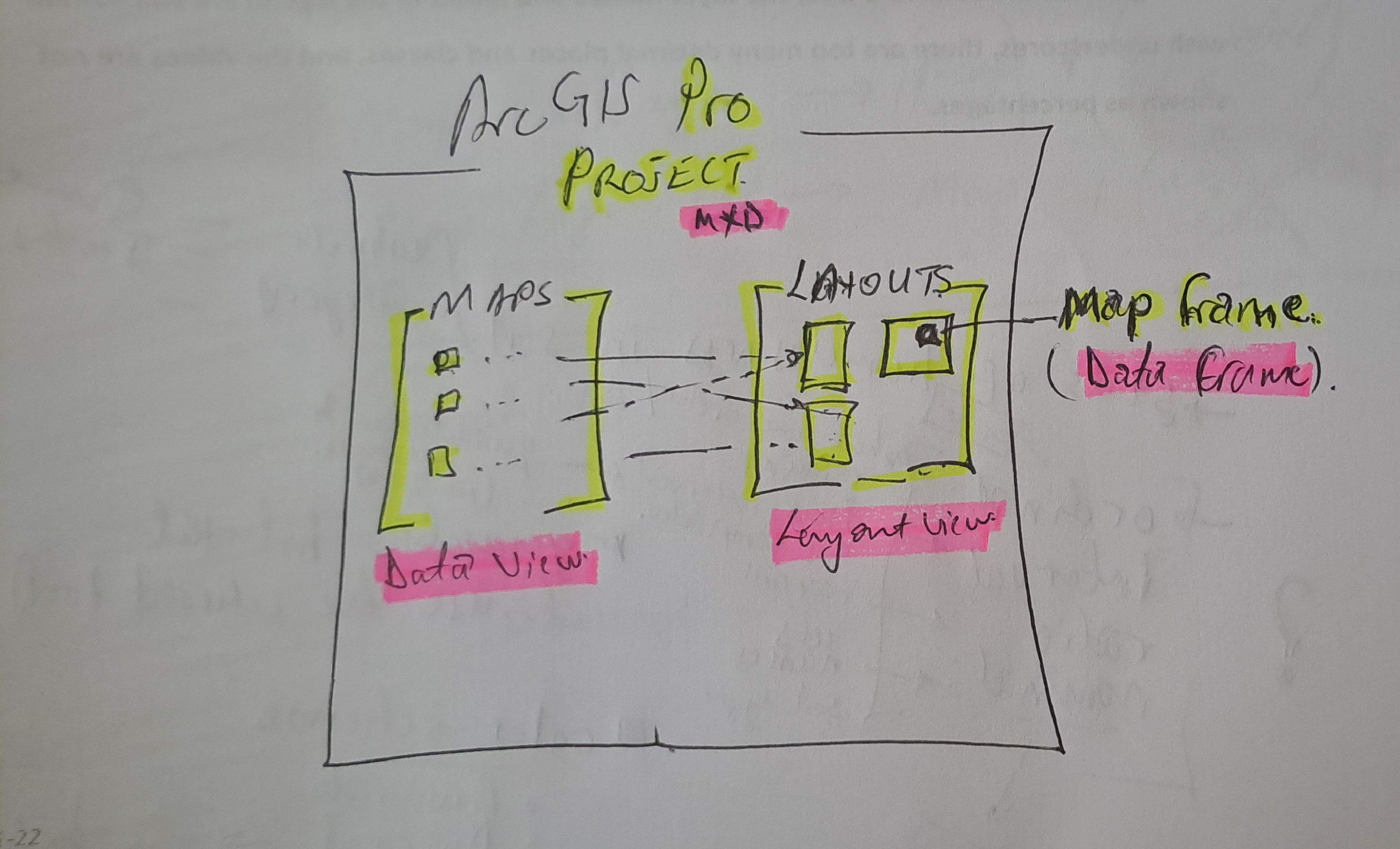
Draw me a picture
The past week I spend doing a course, ArcGIS Pro Standard to improve my software skill level. This was not the first time opening the Pro software though. I have had a few months dabbling in the software especially with data management. So I could easily follow the Course Instructor’s lead. In my head though I struggled with how things worked in Pro vs ArcMap. Somewhere three quarters through the course material, everything clicked in place as I understood things my own way. I came up with a hand sketch and from there-on it was smooth sailing…
#Postscript
Huge takeaway, with a solid understanding of GIS concepts, it’s not hard to learn a spatial information manipulation and analysis software . With Pro, the Ribbon concept and context activated tools improve productivity once one knows where is what without having to ‘Search’ - which in it’s right is a must use.
28 Feb 2025
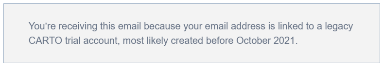
The image above was highlight of an email I received mid-February this year,a few days after I had demonstrated my spatial data visualisation abilities to an interested party. One of my favourite posts which relied on CartoDB came to mind. I got the motivation to preserve this portion of my portfolio of work.
Early Cloud
This made me reminisce all the free, limited use cloud services that scratched a tinkeror’s itch.How at one time I used RedHat’s OpenShift to host GeoServer and ran a PostGIS server on Digital Ocean, just to test the PostgreSQL database connection abilities of QGIS. It is magic to see a table turn to vectors for someone whose background in spatial science is a GIS software environment.


Migrating Maps
The email from CartoDB gave the next steps to the email heading
Your CARTO legacy account will be retired on March 31st, 2025
A new CARTO platform had been launched nearly 4 years earlier (2021).
I determined I was indeed still using the legacy platform. I signed up to the new platform.
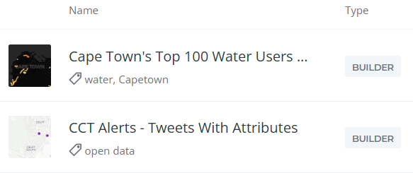
Some of my Carto maps.
There were also some Kepler.gl associated maps. These I didn’t care to preserve. Additionally there were datasets, linked to the maps, which needed to be preserved.
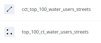
Some datasets.
Data Wherehouse
The ‘new’ CARTO platform had some catchy requirements for a tinkeror but, luckily… I could make use of their own Carto Data Warehouse. However, data needed to be migrated and maps to be recreated.
I created an account on the New CARTO platform. Indeed it carries the shiny feel of 2025 web technologies.
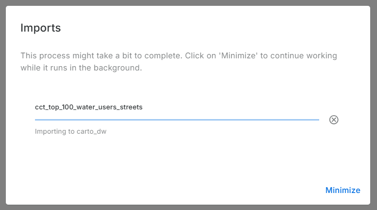
- Downloaded datasets from the Legacy account, chose the CSV file format.
- Uploaded the data (7) into the data warehouse connection - Carto Data Warehouse (carto_dw).
- Default import settings on data types are fine but not when time is converted to text.
- I fiddled with TIME, TIMESTAMP and DATE till I had the GPS Logs data correctly formatted.
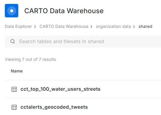
Imported data:
No Yes Visualisation Here
Before spending more effort in coming up with a visualisation, I reviewed Carto’s plans. There is none free there - except trial. So I reluctantly stopped there. Whatever I was going to create here, was going to last for 14 days. Well, I received an onboarding email from Carto while I was still busy with this blog post. I explained that I was not going to complete the migration because there was no (free) plan to meet my use case of the platform. To my delight, Carto responded a few hours later informing my plan had been migrated to CARTO Cloud Native. So finally, my visualisations can be preserved.
.No More Free Lunch!
Carto.com is a breath of fresh air. The tools in there are easy to use and quite intuitive. I tinkered a bit and came up with the below: (Click the Play button.)
Or Interact with the ‘bigger’ map here.
The final animation is no different from the one in the previous version of Carto. except that I couldn’t yet figure out how to let the point ‘persist’ for a bit longer after display.
#Postscript
Thanks to Carto’s generosity I could preserve an element in my Portfolio of work. I have four other maps to recreate, so I’ll save more time to delve into Carto.

