19 Jul 2022
Writer’s Block
So COVID-19 happened and about two years of my blogging streak got swallowed in the global pandemic ‘time blackhole’. The urge to write always lingered though. Google Analytics has been constantly spurring me on with it’s monthly reports of visitors to my site. 59 unique visitors in one month, without active promotion of the site is pretty encoraging. The post of 2018 on Relate and Joins being the most popular. This taught me the apparent lesson that well titled posts generate more hits. I am a ‘spur of the moment’ poet, so a play with words is an ever present temptation. I have however had DMs requesting further information directly from my other posts. The formal work front has been busy and the aggressive fun tinkering side…not so much. The software on my PC and my github repo attest to this ‘writers block’ but, Google Analytics and DMs have drawn me out.
I haven’t been entirely idle though. Having taken some students through fundamental GIS concepts. If it counts for something, I made this globe to pimp my work from home workbench. A labourious but rewarding weekend project.
During

After
Writer’s Back
I am excited to lift out some posts from the drafts folder to published; research on and write about two spatial data wrangling problems I ran into. To keep even busier, have enrolled a mentorship program on setting up and running a geoportal this August. This will be to keep myself busy and sort of relearn some tools I have used before.
#Postscript
The way my blog is set up is a bit of a tangle. I write on my laptop (SubimeText) and publish to GitHub. There are leaner tools to blog with but satisfaction of ‘seeing’ coloured text and git in action tickles the tinkeror in me. “Commit to master”
20 Aug 2019
[A Data Science Doodle]
Map Like A Pro
So at this stage the data is somewhat spatially ready and to scratch the itch of how the Service Requests look like on the ground I went for Kepler.gl
Kepler.gl is a powerful open source geospatial analysis tool for large-scale data sets.
Any of QGIS, Tableau, CARTO, etc would be up for the task but, I chose Kepler.gl because of one major capability - dealing with many many points and that it is an open source ‘App’. (At the time of this writing, it is under active development with many capabilities being added each time.)
Since this exercise was not prompted by an existing ‘business question’, though the data is real, the questions to answer have to be hypothetical. The data at this stage has been cleaned and trimmed ready to use with Kepler. The ready to use CSV of the data can be gotten from here.
Note that this is not the entire data set of the 2011 service requests but it’s a pretty good sample. The CSV is the portion which had atleast a suburb name attached to it. viz was ‘geocodedable’.
Spatial EDA (Exploratory Data Analysis)
By turning the right knobs in Kepler.gl, one is offered the tools to do some quick EDA on the data. Some of the questions that can be quickly answered are
- Which is the most demanding suburbs?
- What was the busiest month of the year?
among many others. Let’s answer these in turn
1. A Demanding Suburb
The obvious way of looking at demand would be to inspect the dots but, that can be overwhelming when looking at 800 000+ points. A better approach is to add a Hexbin Layer based on the service requests points, Add a height dimension for visual effect and size the hexagon appropriately (to satisfaction), then enable the 3D Map in Kepler.gl
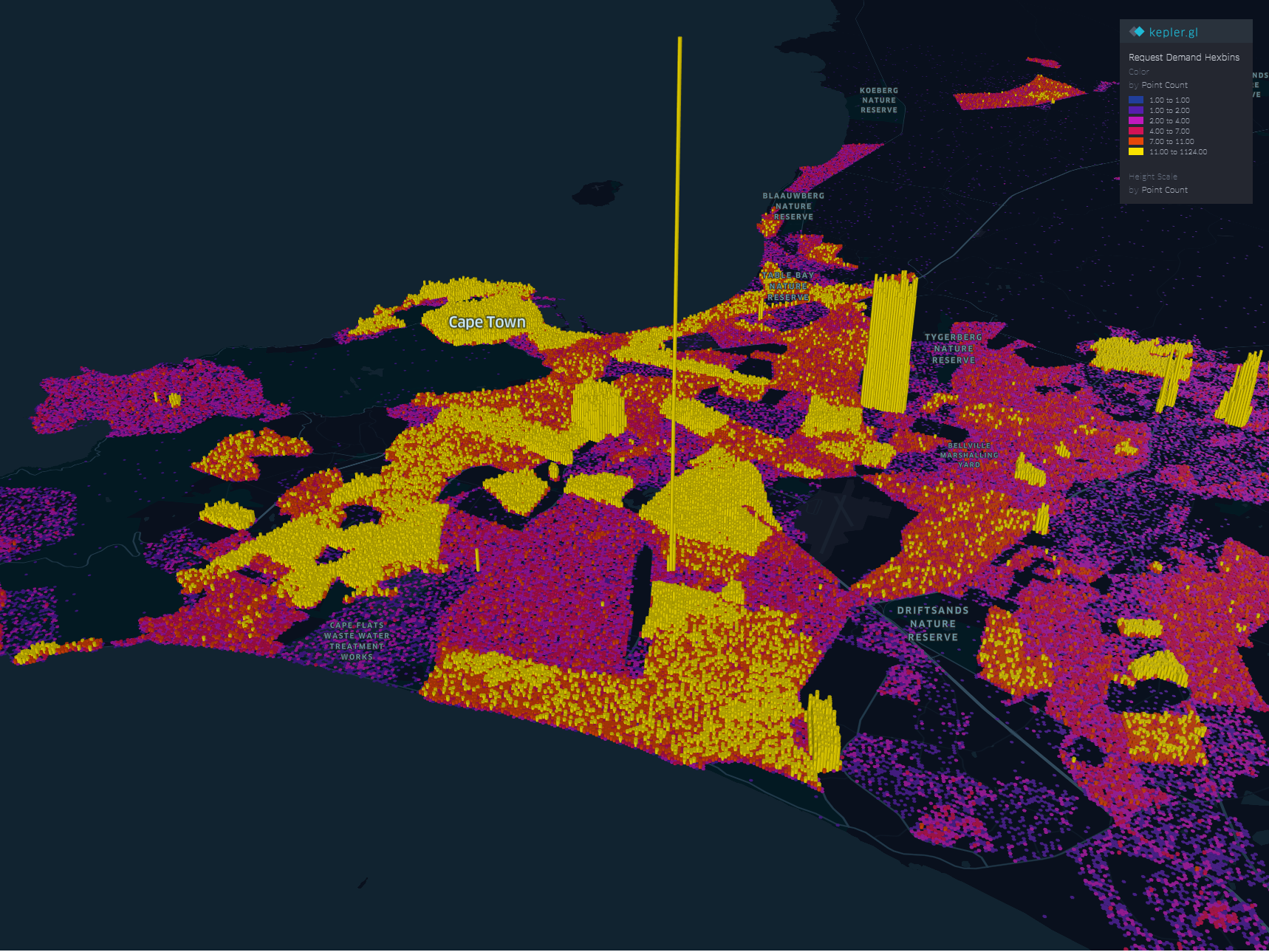
The areas with high service demand become apparent.- Samora Machel, Parow, Kraaifontein Area.
To explore the interactive visual follow this link.
2. The Busy Months
Human have this special ability to identify spatial patterns, couple that with time and we can identify patterns over time. By applying a time filter in Kepler.gl we can scroll through time and truly and get a glimpse of where and when requests activity is highest.
Follow this link to get to the visualisation. Zoom to FISANTEKRAAL - Top-Right quarter of the Map. I have set the ‘windows’ of time to one month and the speed of motion by 10.
You can zoom out to explore other areas, for instance
These questions can be answered with some SQL - but where is the eye candy in that?
These are just the few of the many questions one can answer in Kepler.
Punching Holes Into A Hypothesis
Getting the boundaries wrong ~ The power of map visualisations give one that extra dimensional look at the data. During the data cleaning and processing stage, 1. The Data - Service Requests, one primary aim was to have suburb names conform to a narrow set of names separately sourced. The knowledge of local geography revealed immediately that the definition of suburb ‘Athlone’ was skewed.
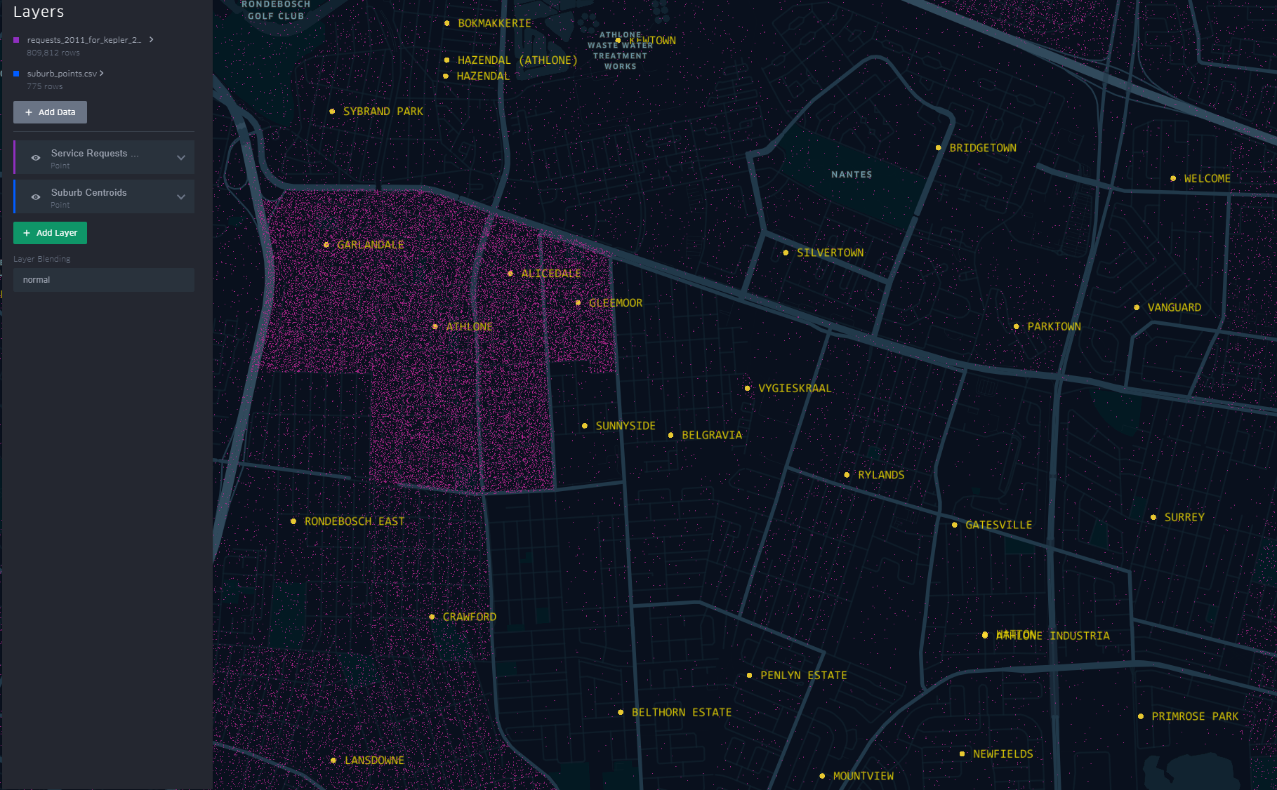
The short-stem ‘T’ cluster of points, to the right in the image, is Athlone as assigned in the dataset. By the looks of it though and local knowledge, the suburbs, yellow labels in the image all belong to Athlone (except the bottom-left quadrant). This then would require a revisit of the methodology when the ‘random’ points where generated.
A similar pattern is revealed for Khayelitsha. All the places of the ‘hanging-sack’, represent Khayelitsha and not just the slanted rectangular cluster of points.
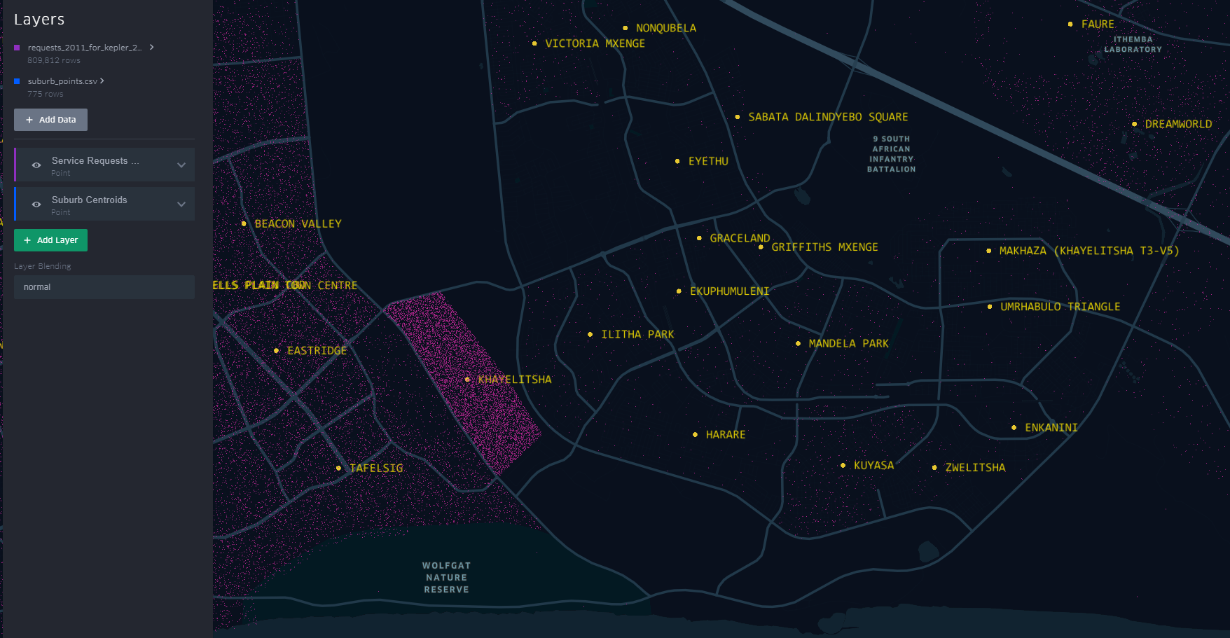
You can have a look at this scenario by opening the link here. Zoom to an area by scrolling the mouse wheel or ‘Double-Click’ for a better perspective.
This scenario becomes apparent when one turns on “Layer Blending” to additive in Kepler.gl
This is just a brief of how one can quickly explore data in a spatial context
#Postscript
I haven’t tried to visualise the data in any of the other ‘mapping’ softwares to see/ evaluate the best for this exercise.
25 Jul 2019
[A Data Science Doodle]
Shapes Meet Words
This stage is about bringing together the suburbs attribute data of 1. The Data and the spatial data from 2. The Data - Spatial.
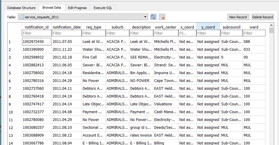
I imported the service_request_2011 data to the geopackage, the data types at this stage are all text and the relation looks thus
-
The fields subcouncil and wards are largely unpopulated and are deleted.
-
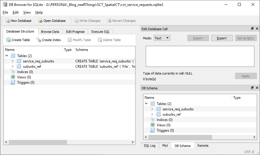
modified table in DB Browser for SQLite to reflect correct data type,
| Field Name |
Data Type |
| notification_id |
(big)int |
| notification_date |
date |
| req_type |
text |
| suburb* |
varchar80 |
| description |
text |
| work_center |
text |
| x_coord |
double |
| y_coord |
double |
Getting The Point
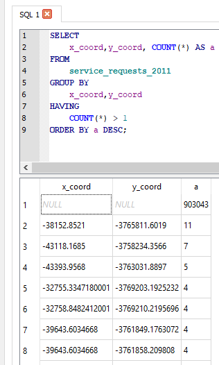
The service request each have an (x_coord, y_coord) pair. However the majority have not been assigned or most likely where assigned to the suburb centroid. So to check on the ‘stacked’ points I ran the query
SELECT
    x_coord,y_coord, COUNT(*) AS a
FROM
    service_requests_2011
GROUP BY
    x_coord,y_coord
HAVING
    COUNT(*) > 1
ORDER BY a DESC
The query revealed:
- Coordinates to be in metres (likely UTM).
- 903 043 records without coordinates.
- The highest repeated coordinate pairs being 11, 7, 5 and the rest 4 and below.
- 3127 records had unique pairs.[ COUNT(*) = 1 in the query above]
Now, identifying invalid x_coord and y_coord i.e coordinates not in the Southern Hemisphere, East of the Greenwich Meridian.
SELECT
    x_coord, COUNT(*) AS a
FROM
    service_requests_2011
WHERE x_coord >0;
(Query was repeated for y coordinate.).
For all the invalid and ‘out-of-place’ coordinate pairs, NULL was assigned.
UPDATE service_requests_2011
SET x_coord = null
WHERE x_coord = 'Not assigned';
(Query was repeated for y coordinate.).
Coming From ?
How Many Requests In This Area
As realised while exploring the service request data, most records did not have the (x, y) coordinate pair, yet consistently had suburb associated with them.
The next step was to assign a coordinate pair to each service request.
The following procedure was adopted.
- Count the records in each suburb (excluding suburb = INVALID). This resulted in a new table service_req_2011_suburb_count.
SELECT suburb, count(suburb) AS records
    FROM service_requests_2011
        WHERE suburb != 'INVALID'
    GROUP BY suburb
    ORDER BY records DESC;
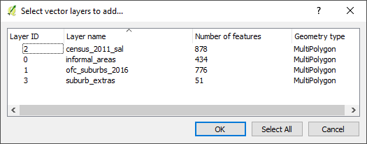
For each of the 4 reference ‘suburb’ layers …
SELECT *
    FROM census_2011_sal AS a
    INNER JOIN service_req_2011_suburb_count AS b
     ON a.suburb = b.suburb
This is essentially a spatial query. ‘Show me all the suburbs from the census_2011_sal layer whose names appear in the *service_request_2011 data.*’ Executed and loaded in QGIS this looks like…
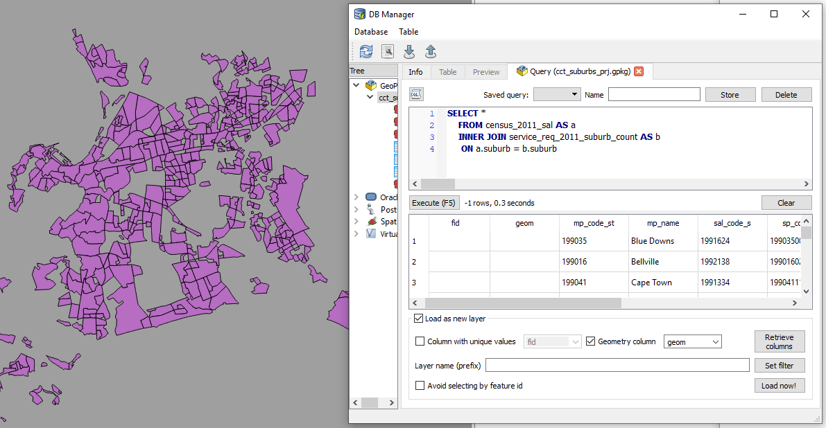
Saved the resultant layer as
census_2011_sal_a.
Now the subsequent query must exclude from the
service_req_2011_suburb_count all the suburbs already used by census_2011_sal (Why? Some suburbs names are repeated across data sets. This is an ANTI JOIN and one of its variations was adopted).
To get the remainder of the suburbs
SELECT a.suburb, a.records
    FROM service_req_2011_suburb_count AS a
        LEFT JOIN census_2011_sal_a AS b
          ON a.suburb = b.suburb
          WHERE b.suburb IS NULL;
The above query creates a new layer service_req_2011_suburb_count_a.
Now to get the matching suburbs from ofc_suburbs
SELECT *
    FROM ofc_suburbs AS a
    INNER JOIN service_req_2011_suburb_count_a AS b
     ON a.suburb = b.suburb
The results being a new layer, ofc_suburbs_a
Using the same procedure, I ended up with
-
census_2011_sal_a
-
ofc_suburbs_a
-
informal_areas_a
-
suburb_extra_a
which I combined to have one suburbs data layer suburbs with 775 records. This compound suburbs layer is a bit ‘dirty’ (overlapping areas) for some uses but for the current use case, perfect (each area is identifiable by name).
GeoCoding The Service Requests
From the initial investigation there were 3127 records which had a valid x,y coordinate pair. This set is about 0.3% of the entire set. I decided to ignore these and bunch them together with the rest of the unassigned records. Of the 906 500 records of service request, 96 688 have status of INVALID for the suburb, leaving 809 812 to be geocoded.
To geocode the service request, I chose the approach to have point for each service request and these appropriately dotted within a polygon.
A Scatter of Points
Step 1 was to generate random points within each suburb corresponding to the number of requests in it. This is accessible in QGIS.
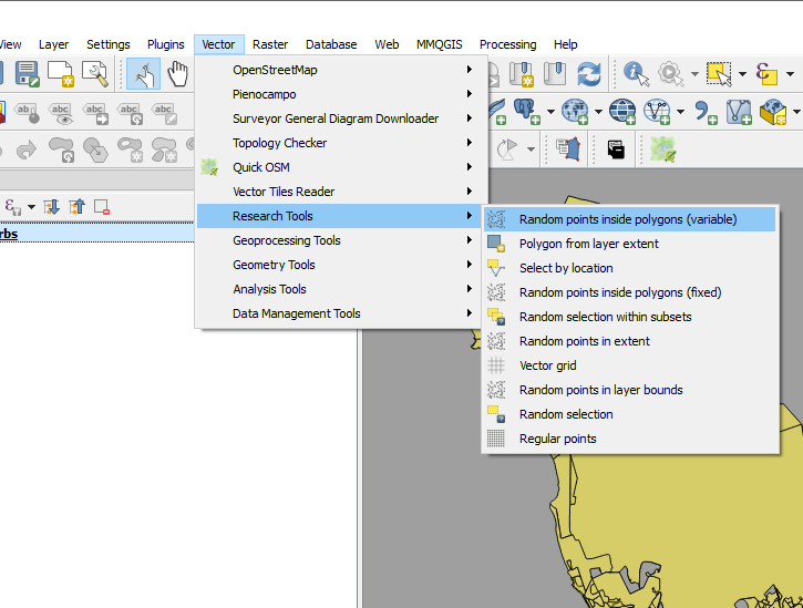
I call this “points scattering.”
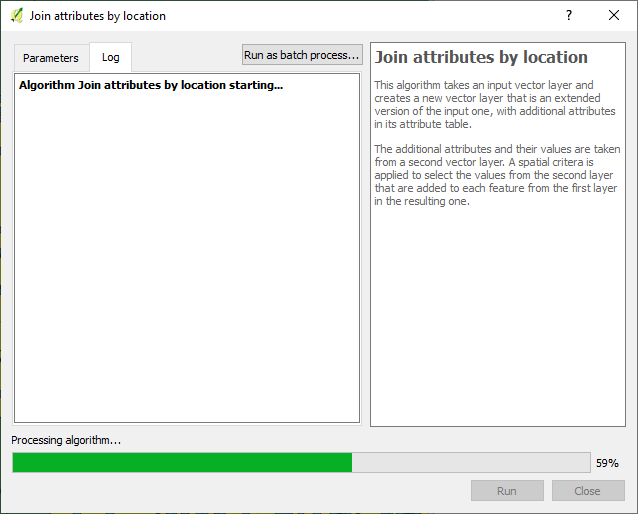
The next step was to assign suburbs to these points i.e. join attributes by location.
Exported the data to geopackage as service_request_points_a with 809 812 points.
So I could do some advanced sql queries on the data. I loaded the data to PostGIS with EPSG 4326.
I then ended up with a set of points, 809 812, which were supposed to have appropriate notification_ids associated with them.
Geography to Requests
Getting the generate points to have notification ids proved to be a challenge. (Revealing a knowledge gap in my skillset). I resorted to tweeter without success.
I decided to ‘brute-force’ the stage for progress’ sake with the intention of reviewing this at a later stage.
So I sorted the service_request_2011 data by suburb, then exported the result (notification_id, suburb) to csv.
SELECT notification_id, suburb from service_requests_2011
WHERE suburb != 'INVALID'
ORDER BY suburb ASC;
The sorting procedure was repeated for notifification_points_no_ids (the random spatial points data created in A Scatter of Points .), exporting (fid, suburb) to csv.
In a spreadsheet program (LibreOpenCalc), I opened the two csv files, pasted the fields side by side (the suburbs aligned well since they were sorted in alphabetical order). The resultant table, with fields - notificaion_id and fid, was exported as csv, reimported into the database as a table.
To get the geocoded service_requests_2011
-- Assign ids of spatial points to service requests ---
CREATE TABLE requests_2011_with_ids AS
SELECT a.*, b.fid
 FROM requests_2011 as a
 JOIN requests_notif_id_points_ids as b
 ON a.notification_id = b.notification_id;

--- Attach service requests to the points ---
CREATE TABLE requests_2011_geocoded AS
SELECT b.*, a.geom
 FROM requests_points as a
 JOIN requests_2011_with_ids as b
 ON a.fid = b.fid;
Next up…some eye candy! With a purpose.
#Postscript
-
Here’s the GeoPackage (Caution! 382MB file) with all the data up to this stage.
-
Using each of the ‘suburbs’ layers used, I created centroids - this can be used later for labelling a cluster of points to get context.
-
While generating points in polygon based on count, the QGIS tool bombed out at a stage. I iteratively ran the tool (taking groups of suburb polygons at a time) to isolate the problem polygon - JOE SLOVO (LANGA).I then manually edited the polygon, then generated the points for it. This error made me question the validity checking procedure I had performed on the data. Add to that, doing an intersect using data in a geographic coordinate system led to unexpected results - Q warns on this beforehand. One scenario was having more than the specified number of random points generated per polygon, e.g. 18 instead of a specified 6. (With the algorithm reading the value from attribute of the data.)
-
Running the spatial queries in the GUI (QGIS) took considerable time due to the sheer number of records. Intersecting the points and the polygons can be improved, taking a tip by Paul Ramsey from here for speed, with the data in PostGIS.
-- CHANGE STORAGE TYPE --
ALTER TABLE suburbs
 ALTER COLUMN geom
 SET STORAGE EXTERNAL;

--Force COLUMN TO REWRITE--
UPDATE suburbs
 SET geom = ST_SetSRID(geom, 4326)

--Create a new table of points with the correct suburbs--
CREATE TABLE points_with_suburbs AS
SELECT *
 FROM suburbs a
 JOIN points_in_polygons b
 ON ST_Intersects(a.geom, b.geom)
05 Jul 2019
[A Data Science Doodle]
Defining Geography
One Area, Many Versions
Inspection of the service request data led to the inference of the underlying place definition. Suburb(s) in this post will be used to refer to a place of geographic extent and not strictly per the make-up of a suburb.As main reference, the Official Planning Suburbs from here were adopted. Due to the shortcomings of the Official Planning Suburbs data (792 records), there was need to have many layers of reference for the bounds within which a service request falls.
The service request data also alludes to the usage of informal settlement names when defining the geography of a service request. Informal Area Data was sourced from here. Unfortunately the domain was decommissioned but, the metadata is here.
Another places data adopted was the Census 2011 Small Areas Layer downloaded from DataFirst, (data). This layer offers a finer grained place name demarcation the census Small Areas.This layer is useful in instances were population has to be factored in. Service requests are geolocated to a ‘smaller’ area which better approximates the original service request origin/ destination.
Therefore
Suburbs Data = Official Planning Suburbs + Census Small Area + Informal Area + Any Other Reference Frame
The spatial data was loaded to a geopackage for further geo-processing.
A Good Frame
Getting Structured
The majority of the service requests were not geocoded or where geolocated to a suburb centroid and that called for a gazetteer of sorts. Inorder to have such a geographic frame the sourced data had to be collated and cleaned.
The exercise was dual:
(i) Trimming the unnecessary and some geoprocessing.
(ii) Ensuring spatial data integrity.
Part (i)
For the four layers (Official Planning Suburbs +Census Small Area + Informal Area + Extra suburbs) I did the following:
-
Created field name suburb and made the names upper-case.
-
Cleaned/ removed hyphens and other special characters from names.
-
Deleted spatial duplicates. In QGIS, ran “Delete duplicate geometries” from Processing Toolbox.
-
Found and deleted slivers in polygons data.
-
Merge by suburb (name) getting a multipolygon for repeated names
1. Census Small Area
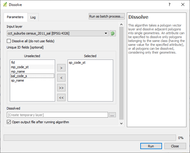
For this data, ran the dissolve operation in QGIS on census_2011_sal on sal_code_s. There were severally named polygons, which is good for population related operations but not for the current geolocation exercise.
2. Official Planning Suburbs
This dataset had 792 records to start with, subsequently reduced to 776 features after removing slivers and ran single part to multipart to deal with polygon for non-contiguous areas.
The informal settlement name was adopted for suburb at times the alias was used since this was referenced in the service requests.
At times neither the SAL nor the OFC Suburbs layer had data boundary data of an area. In such a case, OpenStreetMap was used as reference to define these and I created new areas where needed.
A Tables Grapple
All Together
I exported only the suburb column of the service_request_2011 data from OR and imported the data into a sqlite database.
Similarly exported the attributes of the four suburb reference layers from QGIS as csv files, imported the quartet in OR and exported the compound to csv then importing into the database. This compound had 2139 records (non-unique as some names are common across the set).
There is a knowledge gap. I clearly see there is a better way to this process. This can all be done with some sql chops.
Next was to align the two tables, to which I resorted to
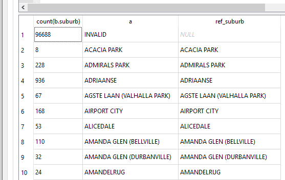
SELECT count(b.suburb), b.suburb AS a, c.suburb AS ref_suburb
 FROM service_req_suburbs AS b
 LEFT JOIN suburbs_ref AS c
 ON b.suburb = c.suburb
  GROUP BY a
  ORDER BY ref_suburb DESC;
The first run gave a gave a discrepancy of 486 viz records in service_req_suburbs layer and not the suburbs_ref.
I went back to OR, suburb by suburb, adjusting the suburb names, creating new place polygons if need be, until the two tables ‘aligned’.
Finally it came to this
Spatial Integrity
At this stage my spatial data is in a geopackage (essentially a sqlite database) and thus I can run spatial sql on it.
To check the validity of my spatial data (which i had not done until now, since my focus has been on attribute data), in QGIS, using the DB Manager i ran
SELECT suburb
FROM census_2011_sal
WHERE NOT ST_IsValid(geom);
for all the four layers. Turns out the geometry is valid as no feature(s) was returned.
What’s In A Place
This exercise has a local context and it makes sense when dealing with the geo data to think about projections. The most appropriate being South African CRS ZANGI:ZANGI:HBKNO19. I however postponed that for a later date and just went with EPSG 4326 instead. (* More on the HBKN019 can be gotten from here* and here ).
#PostScript
I moved my service_requests_2011 data from the sqlite database to the geopackage where the suburbs spatial data was.
The next step is to investigate closely the (X,Y) coordinate pair.
20 Jun 2019
[A Data Science Doodle]
Introduction
This post is the first in a series, The Data Science Doodle, chronicling my journey deliberately, informally getting into Data Science. I plan to write experiences, learnings and report on projects I work on. At the writing of this post, I am working through the R for Data Science book and ‘concurrently’ exploring a dataset of interest. The idea is to evaluate my thought process and workflows, see how, what I learn can be applied to my real world.
The Project
The City of Cape Town makes some of its data publicly available on its Open Data Portal. There’s a plethora of data themes from which one can draw insights about that city from a public service perspective. My focus is on a dataset of Service Requests. Several questions and conclusions can be drawn by digging deeper into this data. I am to understand this data better and see how R can be used to process and manipulate it.
A Brief on Service Requests
The City of Cape Town’s C3 Notification system (now 2019, referred to as Service Requests) was introduced in 2007 to enable the municipality to better manage and resolve residents’ complaints. The success of the system was acknowledged when the City received an Impact Award for Innovation in the Public Sector at the Africa SAP User Group (AFSUG) in 2011.
It is an internal process that is used to record, track and report complaints and requests from residents and ratepayers. There are about 900 different complaint types ranging from potholes, water leaks, power outages and muggings, to employee pay queries or internal maintenance requests.
When residents contact the City, a notification is created on the C3 system. All possible types of complaints for the various different City Departments are catalogued (dated, categorised and geo-coded). The complainant is then given a reference number, which allows them to follow up on the complaint. The notification will be closed as soon as the complaint has been dealt with.
The City’s Call Centre can be contacted by using several channels; calls, email, sms, city’s website, facebook, twitter, App - Transport for Cape Town.
References 1, 2, 3, 4.
Digging-In
The Service requests data can be downloaded in Microsoft Excel format or ODS. To investigate the data I resorted to LibreCalc and OpenRefine ~ a free, open source, powerful tool for working with messy data.
Alex Petralia puts it out well
OpenRefine is designed for messy data. Said differently, if you have clean data that simply needs to be reorganized, you’re better off using Microsoft Excel, R, SAS, Python pandas or virtually any other database software.
Data Explore
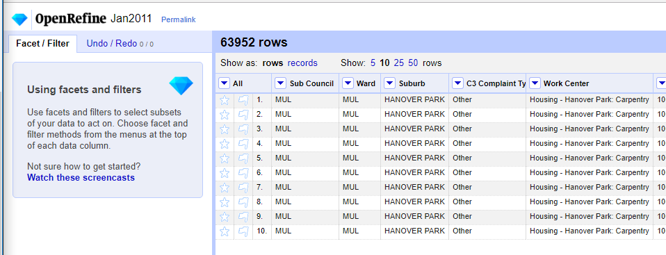
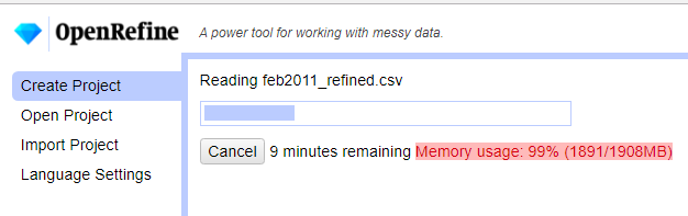
OpenRefine(OR) can work with .ods files but, I struggled to load the January 2011 file. I even increased OpenRefine’s default memory (from 1024 to 2048) setting, still there was struggle loading the file. Opening the file in LibreCalc revealed that the first four rows in the month’s services request records were descriptive fields which even included merged cells. I deleted these and exported the file to text (csv) format.
After the export the file loaded like a breeze in OpenRefine.
I repeated the .ods file cleaning procedure in LibreCalc for all the remaining files February to December 2011. I then imported all 12 csv files into OpenRefine. Again memory was an issue and I increase the value to 4096.
Cleaning Up
All fields where imported as as string/ text into OR. I then renamed and redefined data types of the field names to have some structure.
| Original Field Naame |
New Field Name |
Data Type |
| Sub Council |
subcouncil |
text |
| Ward |
ward |
text |
| Suburb |
suburb* |
varchar80 |
| C3 Complaint Type |
req_type |
text |
| Work Centre |
work_center |
text |
| Notification |
notification_id |
int |
| Column |
description |
text |
| X-Y Co ordinate 1 |
x_coord |
text |
| X-Y Co ordinate 2 |
y_coord |
text |
| Created On Date |
notification_date |
text |
| Notification Created (just ‘1’s) |
*removed/ deleted |
|
| Imported .csv file name |
*removed/ deleted |
|
Notes:
- (*) planning to index the suburb field.
- x_coord, y_coord: set to text for now as focus on them will be much later.
- notification_date: Is truly date, formatting will be later.
- notification_id: is the unique request identifier. Assigned type (BIG)INT (so as to avoid problems later when the data grows - Hint from the web, Digital Ocean.)
Aside: Now, is it work_centre or work_center ? well, it’s command center!
The following operations where applied to the fields to clean it somewhat in OR;
- Trimmed white spaces.
- Collapsed consecutive white spaces.
- Convert all suburb names to uppercase.
- Transformed notification_id To Number
- Reformatted notification_date to the format YYYY.MM.DD .(The plan being to later import the data into a PostgreSQL database.)
Some OR transformation expressions and functions are documented here.
For the date transformations I took a hint from here and using the expression
value.slice(6, 10) + '.' + value.slice(3, 5) + '.' + value.slice(0, 2)
another GREL expression which was widely applied to populate a field with values from another field
cells["work_centre"].value
Messy Suburbs
The most time consuming stage was cleaning the names of the suburbs. Why suburb? As a “geo” person, the mind is wired to think geocoding and suburbs is a good reference. The (x_coord, y_coord) pair for this dataset was largely unassigned which led to the focus on suburb.
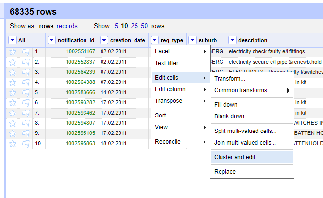
The Cluster and Edit Operation was mostly used. The variations in the names was very wide. Hinting to a lack of standardisation on the names and most likely alluding to the use of ‘free-text’ in the initial capture of the Service Requests.
Some records had suburb value ‘UNASSIGNED’. For suburbs which did not ‘make sense’ in a local context, like London, UK, I assigned INVALID.
Taking Stock (A Database)
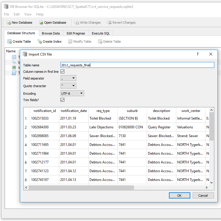
As an intermediate stage I exported the records as SQL from OR to a sqlite database. cct_service_requests.sqlite3
[Aside: “use .sqlite3 since that is most descriptive of what version of SQLite is needed to work with the database”;Tools: DB Browser for SQLite Version 3.10.1 (Qt Verson 5.7.1, SQL Cipher Version 3.15.2)]
Exporting the records to SQL from OR resulted in Out of Memory issues even with 6GB dedicated to OR and the data with 906501 records. I resorted to importing a CSV instead.
I was looking at retaining suburbs with atleast 5 or more records or less if there was a corresponding suburb defined. Those with any less were assigned to the larger area boundary. To get insight into the suburbs I used the SQL Query
SELECT count(suburb) as a, suburb
 FROM service_requests_2011
    GROUP BY suburb
    ORDER BY a DESC;
There were 3659 unique suburbs. Largely with a count of one, of which on inspection were clearly a result of typos during data entry.
Having done the identification of non-unique suburbs. The task was now to identify these in OR and clean them up.
Getting Help
Somewhere along the processing I came across ‘noise’ in the data which gave me memory issues in OR and spreadsheet programs. This had caused the data file to balloon to 800MB+.
I resorted to twitter for help

In summary the technique to clean the data was
I used Facet -> Customized facets -> Text length Facet on the ‘suburb’ column, then adjusted the filter to remove the highest value which was a single huge outlier…
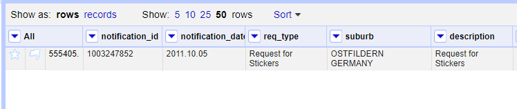
The problem record entry was notification_id = 1003477951. I deleted this and proceeded with the cleaning.
Readying
After further cleaning there were now 1100 unique suburbs with the highest count of 4.
The Next Stage was to match this service request data with the spatial reference frame.
At this stage one can start doing miscellaneous analysis of the 2011 service requests. Distribution per month, per suburb, most requested service, etc.
#PostScript
True to the “80% is spend in data cleaning” assertion, this portion of the project took a lot of time! Next up is the preparation of spatial data for the suburbs. Using the suburbs list from service_requests_2011, collate a corresponding spatial dataset.

