07 May 2019
SCT Part 5
Loading…

When the year began, I resolved to blog at least twice a quarter. That has proved to be too ambitious. The ‘distraction’ has largely been a dirty dataset I was, still am, cleaning. You see, I am now a wannabe Geo-Data Scientist. This hype and perception of self has been influenced by endless periods of watching Pyception. I am proudly, progressively going through the book, R for Data Science, affectionately known as R4DS. Honestly one of the spurring factors are the cool and sophisticated looking graphs made with ggplot.
Map Monkey
Since learning about it, I have tried as much as possible to not myself mold into a ‘Map Monkey’ or ‘Button-Pushing’ GIS Analyst. This year I have taken up Data Science, the buzzword of the moment right? I see M.L. and A.I. are trending actually. As a geospatial specialist there is demand for one to be a ‘data manager’ already. Map production or results from a spatial analysis demand one massage data in one way or the other. Taking on stuff about data and some stats shouldn’t be too foreign. So in the first quarter of 2019 I was setting up my machine for Data Science and studying the same. It was pleasant to discover that Geographic Data Science is actually a thing and I am not being very divergent from years I have already invested in work and study.
So here’s a peek of what’s on my PC.

I chose Chocolatey to spare me hours of troubleshooting dependency, local installation paths issues with Node, Yarn, et. al. I must mention though that having DBeaver running wasn’t straight forward. The solution came from here and some of the screamed at screen shots are shown below.


I cannot, not mention kepler.gl, the reason I have Yarn up there. Kepler.gl is any spatial data visualisation enthusiast’s goldmine. You look like a pro with very little effort. I have gone through various blog posts and video tutorials to try and Think Like (a) Git with minimum success. So hopefully my learning R accompanied by version control with the help of GitHub for Desktop should help. See, I have been abusing GitHub for just an online storage and blog hosting space…none of the version control functionality.
Endearing Geo
I still love my geo, so when I hit a wall with the Data Science ‘things’, I fire up QGIS and dabble my spatial data in PostGIS. As one who is a tinkerer, I picked somewhere that SQL skills are an important must have for a geo person, moreso Spatial SQL. ( This article makes a great read on the importance of SQL for a geo person and how to get started. My blog chronicles my personal path of the same).
EnterpriseDB distros of PostgreSQL really make the installation and configuration of PostGIS a breeze. Within minutes one has access to a functional sandbox and production ready space. Through click click, type type I had PostGIS ready.


DBeaver has become a dear companion navigating the SQL land, with the plus of a progressively improving spatial view. DB Manager in QGIS is a great go-to when QGIS if fired up.

Still I cannot just dash over the ability to view spatial from within a database (DBeaver) environment. PgAdmin 4 has a spatial viewer but a little more Googling tends to put one off when it comes to the design of PgAdmin 4. There also have been efforts to have a simplistic spatial viewer, my favourite being PostGIS Preview, although I haven’t been able to make it work yet. Sometimes it is good to be able to see ‘map’ data without having to fire up a GIS program. Which makes spatial data view in DBeaver celebratable …enforcing the notion of “spatial is just another table in the database” aka spatial is not special. Well, it is special when you need to know about EPSG codes and why, when to use which.
New and shiny get’s my attention, so I have also tried Azure Data Studio just for the preview PostgreSQL extension. This release was apparently a big thing . I experimented with it a bit, connected to my PostGIS and decided to settle on DBeaver.
“Be really good at one thing”, right?
#PostScript
So I’m off to learning R, SQL and git just to be Button Pushing GIS-Analyst, Not. The next blog post should be about Data Science, Geo Data Science.
31 Dec 2018
SCT Part 4
All That Glitters

Image credit - Gathua’s Blog
The above is a typical representation of Cape Town night lighting. How would that look like from space? One way to answer that is demonstrated here but, the data used there is quite coarse. This post is on a similar approach with the further investigation of finding the brightest spot on a Cape Town night. Data on the location of street lights was used as provided on the Cape Town open data portal.
Some Assumptions
- Street lighting is the only lighting at night time at a place.
- All street lights are represented (no broken light).
- The dataset is complete and accurate (temporally).
- All the lights have identical lumens.
- [Other implied assumptions.]
Public Lighting
The subject data is described as “Location of street light poles and area lighting (high-masts) in the Cape Town metropolitan area.” - Public Lighting 2017.zip
In Q, I ran Statistics for text field to find out how many unique lighting types there were. Just two - Streetlight and High-mast Light. A total of 229 538 lights.

The distinctiveness of street light types persuaded me to give greater weight to the High-mast Light. So, an additional assumption -
High-mast Lighting is twice as bright as just Streetlight lighting.
So in Q I created a weight field and populated it appropriately.
To scratch the curiosity itch. The lighting in Q, for the CBD and surrounds.

Boot Strapped Visualisation
If you haven’t heard of Kepler.gl you must check it out. I handles your geodata in the browser and does some amazing things.
First step is to convert the shapefile to csv, json or geojson. In Q this is achieved via right click on the layer and Save As.
Load the CapeTown_Public_Lighting.csv in Kepler.gl
(On loading the CapeTown_Public_Lighting.csv in Kepler.gl the weight field was being interpreted as type Boolean and not just Integer. It turns out this was a bug (December 2018). I quickly remembered this as I am actively ‘watching’ the Kepler.gl github repository)
As a workaround I used weights of 100 and 200 for the StreetLights and High-mast Light respectively.

Panning around the map, the above caught my eye. Turns out the more isolated dots are high-mast lights. Actually in Kepler, you can filter/ view a type at a time or together using different colours and a whole other options.
Our objective of finding the brightest spot requires we aggregate the points data. That is home turf for Kepler. With a few clicks we have this;

We are looking for The Brightest Square Kilometre and we factor in the assumption high-mast light = 2 X Streetlight.
So in order to get to calculating the correct area for the hexagon being employed by Kepler, I got to asking.

Taking a hint from here and using the formula
A = ½• n • r² • sin( (2π) / n)
where:
- A is the area of a polygon
- r is the outer radius
- n is the number of sides
I got the radius as 0.6204 km
Under Radius Tab, Enter Radius value of 0.6204 and decrease the Coverage (base area of the hexagon being visualised)
Switching ON The Enable Height Tab - Enter a reasonably high Elevation Scale, The HeighT is based on Point Count.
High Precision Rendering turned ON.
These parameters aid quick identification of the ‘tallest’ hexagonal column hence the brightest square kilometre. With a count of 923.

Light Weight
To take into account the weight of the light type (high-mast vs street light), we add another data layer (a duplicate of the CapeTown_Public_Lighting.csv really), apply a weight filter Add a Layer based on this and style it with similar parameters to the first Layer. (At the time of writing this post, a filter when applied to a dataset affects all the layers based on it. Hence the need to duplicate the dataset with this approach.)

With a highest count of 52 per the square kilometre. Even doubling high mast lighting for impact falls short of the 871 (923 - 52) of ‘StreetLight’ alone.
Now styling the High Mast Lighting with grey scale…so we can see the two together.

There is apparent correlation - Highly lit areas also have high mast lights. High Mast ~ ‘white’ columns.
You can interact with the Street Lights Map below.
#PostScript - Replicate
Kepler.gl is under active development and new features are being added continuously including some fascinating ones on the developers’ road map.
One of the features is the ability to share a visualisation easily. So here goes:
27 Dec 2018
SCT Part 3
(18.42281, -33.95947)
So, those are the numbers (coordinates) to keep and punch into the satellite navigator in the unlikely event of the Atlantic Ocean bursting its Cape Town shores. If you stay in Cape Town, the first place that comes to mind when you hear ‘Flood Survival’ is likely Table Mountain and rightly so. But, which spot exactly can one stand longest on solid earth in the event of a massive flood?
How To DEM
Get Data
Relief maps always get my attention. The mystery of attempting to model reality on the computer enthuses me. There are plenty tutorials on the net on how to do this so here’s my version.
I got some vector base data (Metro Boundary, Suburbs, Roads, Railway Line, Building Footprints and a DEM - Digital Elevation Model ) off City of Cape Town’s Open Data Portal or here. The vector data, I loaded into a geopackage. How? Of special interest was the DEM, described as “Digital model (10m Grid) depicting the elevation of the geographical surface (Bare Earth Model) of the Cape Town municipal area.” The Open Data Portal has the data stored as 10m_Grid_GeoTiff.zip.
Style Terrain
After extracting the compressed elevation data, I loaded it in QGIS.
- Load 10m_BA,
- Style the ‘relief map’ in Properties –> Style

The raster would then look as shown below

-
Now to create a hillshade. Do Raster –> Analysis –>DEM (Terrain Models)…
With the settings shown below create a Hillshade DEM

This gives us a hillshade …

- To get us a Terrain Map. Set transparency in the Relief Map (10M_BA). RightClick –> Properties –> Transparency

- Now a combined view of The Relief and Hillshade …

- Now Load the other support vector layers
- Metro Boundary (Flood Plane)
- Suburbs
- Roads
- Railway Line
- Building Footprints

Getting 3D
To get started with 3D Terrain. Load and activate the Qgis2threejs Plugin.(Read more). (This is one approach to getting 3D in QGIS. At the time of writing this post, 3D comes native with QGIS. Read (more.). But, I was using QGIS 2.18.7, Portable gotten from here.
The Qgis2threejs Plugin is unique in that it bootstraps the process to have a web ready 3D model to play with.
- Launching the Plugin for the first time should give something like this …

- Zoom to Cape Town CBD and include all of the table of Table Mountain.

Now, to prepare for exporting the subject area, emulate the following series of settings paying attention to the parts
World, DEM, Roads,


The Surburbs Layer is used mainly for labelling purposes in the final export. We are not interested in showing the Suburbs boundaries for now.
Through Trial and Error and guided by the absolute height of the DEM, we get the optimum height value, 1 060m, to use for our Flood Plane (Which in essence is just a polygon covering all of our area of interest - Metro Boundary in this case).
Export To Web
In order to have an interactive 3D Map simulating a flood.
-
Ensure 3DViewer(dat-gui).html is chosen under the Template file in the Qgis2threejs Plugin.
-
Choose the appropriate path and name for the index html for the visualisation. In this case CCTerrain.html is chosen.
-
Export and Qgis2threejs will generate the necessary style sheets and other files for the export.
-
Now using a text editor, edit parts of the exported html file (CTTerrain.html) to reflect what the project is about and put in some usage information.
A Preview below - full screen here
#PostScript - Find The Safe Spot
Click around the map to turn on/off the layers.
03 Jul 2018
SCT Part 2
Embracing Text
In the previous blog, we explored how we can load (explicitly) spatial data, initially in shapefile format, to a geopackage. In this post we explore the loading of relations a.k.a table to the geopackage. Again, data from the Open Data Portal is used.
Data Is Rarely Clean!
We will explore “Data showing City land that has been disposed of.” The data is spread over several spreadsheets covering various time periods. In some instance yearly quarters. The data custodian is given as “Manager: Property Development & Acquisitions city of capetown.”
In the data wrangling process using LibreOfficeCalc, the open source equivalent of MS Excel. Several attributes will be learnt about the data. Especially that which hinders a refined data structure. Issue will be varied, among them:
- Not all records being filled in.
- No consistency to period of registrations.
- Inconsistent formatting of currency.
- Sale price included or excluded VAT inconsistently.
- Typos in area names.
- A regions field which definition could not be got from the Open Data Portal.
To improve the data we may end up
- Adding some fields to improve schema
- Concluding area field = Suburb Name (per suburb_layer from previous blog post)
- Matching the area field names to match up with Suburb Name in the Base Suburbs reference data we adopted.This procedure inadvertently modifies data from it’s original structure. However, knowledge of local suburb boundaries and place locations means the impact will be minimised.
Casual inspection reveals
- A lot of sales to churches and trusts. Possible follow-up questions would be. Was this influenced by any legislation in a particular year? Which year saw the largest number of sales to churches?
Loading Tabular Data To Geopackage
With the Land Disposals data, covering several years, curated and consolidated into one spreadsheet. It is time to import this data into our geopackage. Here are the steps to do it:
1. From the Spreadsheet application (OpenOfficeCalc), Save file as and choose Text CSV (Comma Separated Values).
To load the Text File to the geopackage we use any one of the two approaches.
Method 1: Using QGIS
1. Start Q if not already running.
2. Select Add Delimited Text. This is a large comma icon with a (+)plus sign. When you load the file, it will likely look like the screenshot below. (Note that the image shown here is of a file that would have undergone considerable pre-processing. Especially on field names and data types in cells.)

Make the selections as shown above. In particular ‘No Geometry’.
Opening the table in Q we see the data we just imported.

Now let’s save this to the GeoPackage.
3. Rick Click the Layer name, –> Save As. Then specify the location of the geopackage. In the dialog box that comes up, under Geometry, choose No Geometry. (We are just importing a non-spatial table.).

That’s it!
Let’s explore an alternative way of getting the text file into the GeoPackage.
Method 2: Using SQLite Browser
1. Open the GeoPackage in the SQLite Database Browser.
2. Do File –> Import –> Table from CSV.
Check on; Column Names in first line and Trim fields?. Separator is comma.

Done!
3 Switch to the Browse Data tab to see what we have just loaded.

A Review: What To Choose
On inspecting the table loaded with QGIS and SQLite Browser. Somehow Q correctly and auto-magically distinguish text and numeric field data types. SQLite Browser made everything type “TEXT” in this particular case.
Let’s experiments some more with our data.
Close SQlite Browser and switch to QGIS. (It is good practice to close one application when accessing data from another. Particularly if you are to do editing.)
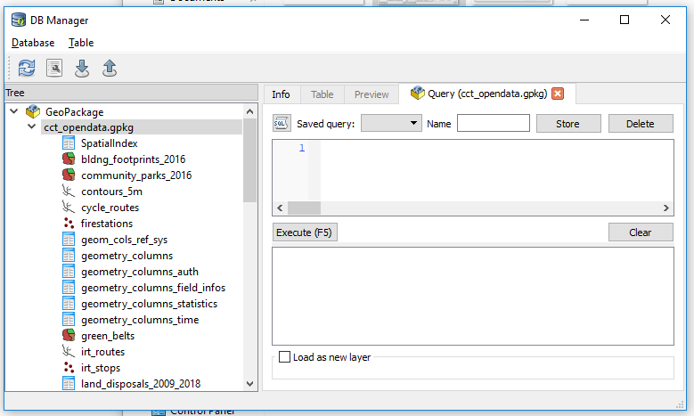
Launch DB Manager and Browse to the geopackage.
Let’s see how many distinct suburbs do we have in this table.
Start the SQL Windows and run…
SELECT DISTINCT  area FROM  land_disposals_2009_2018
ORDER by area ASC;
we get 102 records . We see there is NULL in first entry so we really have 101 records. On close inspection we notice there are a lot of typos in some names.

We will need to clean this data if we are to have meaningful analysis later on.
Let’s check the suburbs layer and see how the data compares
SELECT DISTINCT  NAME FROM  suburbs
ORDER by NAME ASC;
We get 773! This is gonna be interesting, especially getting exact matches.
Before cleaning the data further, lets see if we can ‘connect’ the suburbs and land_disposals datasets.
SELECT  * FROM suburbs
JOIN land_disposals_2009_2018
ON suburbs.NAME = land_disposals_2009_2018.area;

Yep! We have some hits.
We are going to be basing our analysis on the suburbs layer so we use that layer for a base and format subsequent datasets after that it as much as possible. Cleaning can be done in QGIS user interface editing or better still in the sqlite database (geopackage) using SQL.
#PostScript
The take away is that GeoPackage can store tables, no sweat.
The join operation used above is simplistic. One would need to appropriately use LEFT, RIGHT, INNER JOIN.
I used:
- QGIS 2.18 (DB Manager)
- DB Browser for SQLite 3.10.1
- SublimeText 3.1.1
15 Jun 2018
When A Relate Won’t Do
While working on the next part of my series of blogs I ran into an interesting ‘discovery’ which warrants an interjection. Testing the data loads into a geopackage, I decided to join a spatial and attribute data AND retain the results as a new ‘layer’. Tools in the QGIS Processing didn’t help much. So I Googled for a solution. To my surprise I got a few first time hits. I learnt MapInfo can do it so can ArcMap. There we also suggestions of having a relate in QGIS. But, that’s not what I sought.
Buried in a Google Forum was the solution by Thomas McAdam. So here’s how I ended up doing it … so we have one more source for the solution on the web.
Love The Database
A pre-requisite to the procedure is to have the data stored in some database and that’s not scary at all. I explain one way to doing that here creating a Geopackage. You can also create a SQLite Database as explained here. You don’t even have to leave the comfort of Q while doing it.
A One To May (1-M) Join
With the objective of joining two datasets and keeping the results. The assumption is that your data is clean and you have common fields between your two datasets.
- Table 1: suburbs - Has polygons of suburbs I wish to join (One Record).
- Table 2: land_disposals_2009_2018 - which has sales records per suburb (Many Records).
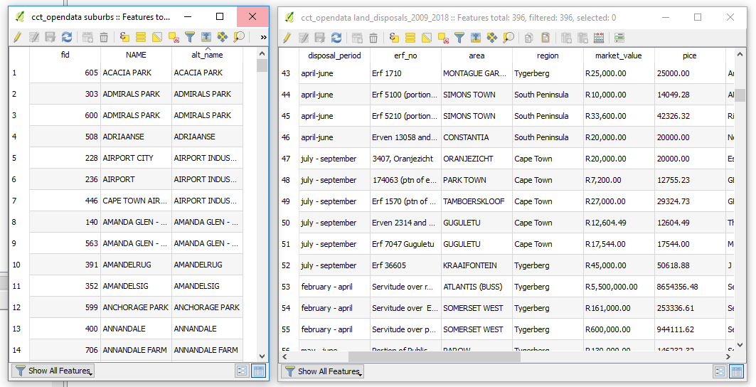
Now, with the target datasets loaded in a ‘spatial database’ as suggested above.
- Within the window write SQL Statement to JOIN our suburbs with the land_disposals_2009_2018 table.
Which translates to
SELECT  *
FROM suburbs
JOIN land_disposals_2009_2018
ON suburbs.alt_name = land_disposals_2009_2018.area;
Simply put this says, “Basing on the common valued fields alt_name and area of the suburbs and land_disposals_2009_2018 layers respectively, join these two.”
-
Click on Execute to see what results this gives. (An inspection will help verify the legitimacy of the operation we just ran.)
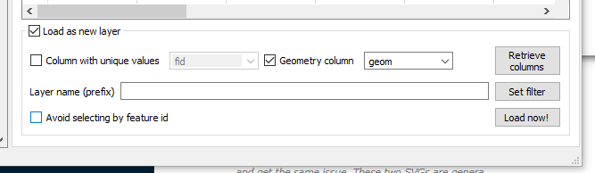
- Tick the Load as new layer Check Box near the bottom of the SQL Window.
-
Tick the Geometry column Check Box. (Selecting a value that looks/ read something like geom).
- Now click on Load now! to have the results display in Q.
Results, If You Please.
On clicking Load Now! The Q canvas will fill with spatial, familiar ground!
To Save the results, Right Click the layer name in Q, Save As and we can save to any format supported by Q to our heart’s content.
#PostScript
The JOIN used here is an overly simplified approach to tip-top SQL queries. I would recommend intensive reading up on the JOIN operation as things can really go wrong surreptitiously.

