01 Jun 2018
SCT Part 1
Scrapping For Data
The City of Capetown has a great and searchable place where data on and about the city is shared openly. The data is currently being migrated to a Portal for ArcGIS site which will bring with it a wealth of features and functionality. For now (June 2018), I am happy with the ‘simple’ site. This post is about collating spatially formatted data on the City of CapeTown. (Well, as provided on the open-data portal.)
So to start out I got city-wide base data from the Open Data Portal site and any apparently interesting themes, storing it locally for easy reach. The data was in compressed zip files, excel spreadsheets, pdfs and ODS files. I just dumped these, after some processing, in one folder. Fortunately there was sanity to the file naming from source.
Creating a Geodatabase
I went with GeoPackage for data storage/file format. So I could learn more about it and also because I have been hearing about it more often. Recently from FOSS4GNA 2018. I used primarily Q, QGIS and other tools I will mention. Here’s the step by step:
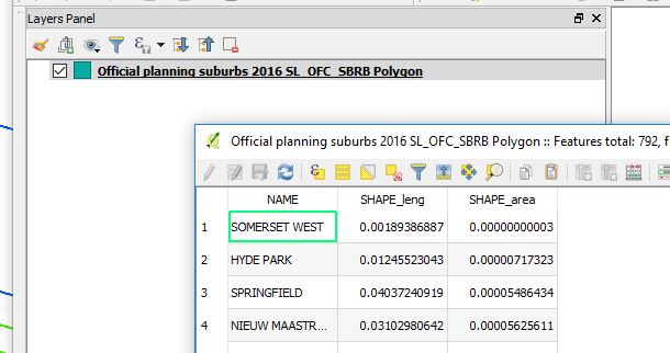
1. From the Open Data Portal, search and download the suburbs spatial data. This is available in zipped shapefile format.
2. Load the official planning suburbs data (zipped) shapefile in Q. The CRS(Coordinate Reference System) in Q set to ESPG:4326,
3. Right click on the suburbs layer, then Save As…leads to a dialog box of format choice and other options. Choose GeoPackage for a format.
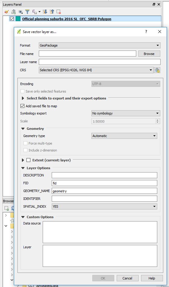
- Select FileName and browse to the appropriate location. Enter the Geopackage Name (cct_opendata.gpkg).
-
Edit Layer name (suburbs). (Taking out the original Planning and Official to reduce characters in the layer name). CRS Auto populates to EPSG:4326, WGS84.
-
(Encoding is Grayed out at UTF-8 which is okay. we chose this when we loaded the suburbs shapefile).
-
Expanding the “Select fields to export and their export options”. Tick off SHAPE_leng and SHAPE_area. (Area and Length are not really useful especially when using a Geographic Coordinate System. Additionally, these where values calculated in the original gis software the data was exported from so we drop them to avoid confusing ourselves when using this data in our new geodatabase we are building.)
-
Keep “Add saved file to map”. (So we will be able to see if our export went well).
- There is no Symbology to export so skip that part. (We have not done any styling to our data yet which we would want to keep.)
On “Geometry”, Q has it as Automatic. (Q will correctly interpret this as polygon which it truly is.)
On “Extent”, Choose layer. Which defines the bounds of City of Capetown .(Well, I have prior knowledge of this. Local context data)
Layer Options:
Q has a tooltip for these fields. So hovering a mouse gives a hint what a field is for.)
- DESCRIPTION: set to “Official Planning Suburbs”
- FID:fid (Kept as is. Means Feature IDentity we infer.)
- GEOMETRY NAME: geom (Shortened from geometry. A matter of preference from previous experience. Conveniently short when writing out SQL statements.)
- IDENTIFIER: Suburbs
- SPATIAL _INDEX: YES (This helps in speeding things up when doing queries and spatial stuff with this layer.)
Custom Options:
Conveniently, the data from the Open Data Portal comes with some metadata. So we use that to populate these fields. Better build a comprehensive database from the ground up for future usage’s sake.
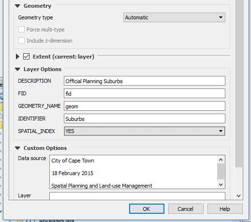
On OK.Q loads the GeoPackage and subsequently the layer. Q has made the export MultiPolygon and not just Polygon. (We will investigate this later.)
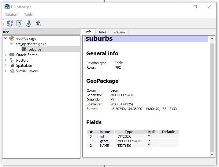
Our Geodata, The GeoPackage
To see what we just did. In Q, Load Vector data. Point to the GeoPackage (cct_opendata.gpkg ) and Voila! Our Suburbs data ‘geopackaged’ and with only two fields “fid” and “NAME”.
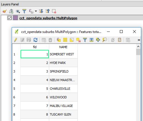
(From previous database fiddle experience, something about the “NAME” field in CAPS bothers me. We’ll deal with it late if need be.)
To take a peek into our GeoPackage
Launch DB Manager from Q.
-
From Menu –> Database –>DB Manager –>DB Manager
-
Right Click on GeoPackage.–>New Connection. Point to the GeoPackage (cct_opendata). A connection is added and therein is the suburbs layer we just added.
From here there is a plethora (I could be exaggerating) of GeoPackage versions. So lets’s investigate which version we just created so we know in case of eventualities as we build our datastore. We get a tip from here on how we can check a geopackage version.
With the GeoPackage opened in DB Manager.
- Launch the SQL Window (Database – >SQL Window).
- Then type
then Run (F5) the query.
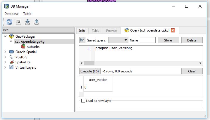
User_version ‘0’ is not very indicative.
- Run the following query in stead
then Run (F5) the query.
We get a better results. Let’s interpret ‘1196437808’. from this guide we learn “1196437808 (the 32-bit integer value of 0x47503130 or GP10 in ASCII) for GPKG 1.0 or 1.1”
So our geopackage version is atleast 1.0.
While we are still at the SQL Interface. Let’s interrogate our ‘suburbs’ data.
How many suburbs are in our table?
SELECT Count(fid) FROM suburbs,
792 suburbs!
Fiddle
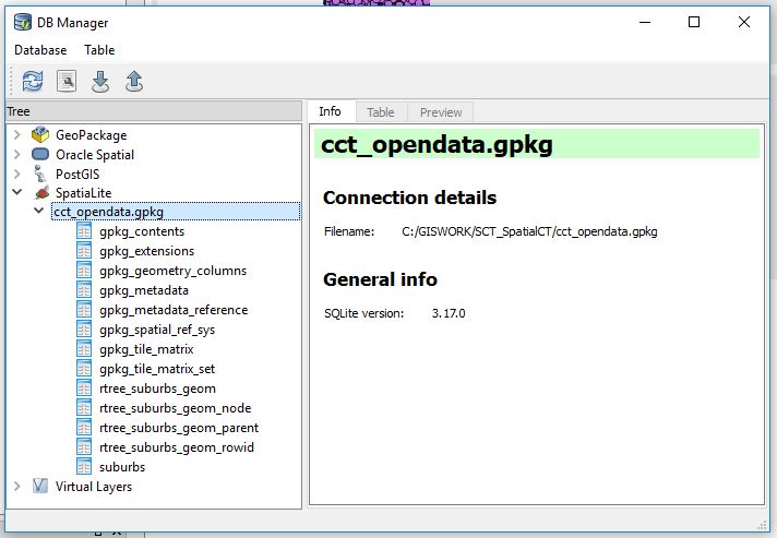
“A GeoPackage is a platform-independent SQLite [5] database file that contains GeoPackage data and metadata tables.” Source.
From this we infer that we should be able to explore the GeoPackage somemore with DB Manager as a SpatiaLite database.
- Right Click SpatialLite icon —>New Connection, then point to cct_opendata.gpkg. Expanding it reveals the contents.
More about those fields is explained here. Not for the faint hearted. Gladly we can just point Q at the geopackage and get our layer(s) to display!
Stacking The Store
To add more data to the GeoPackage. Repeat the procedure described in Creating a GeoDatabase above.
So I went on to load several layers form the Open Data Portal. After several clicks, some typing and 1.5Gigs later, 22 spatial data layers! (These were pseudo-randomly selected. No particular preference just a hunch that the data may help answer a question yet unknown.)
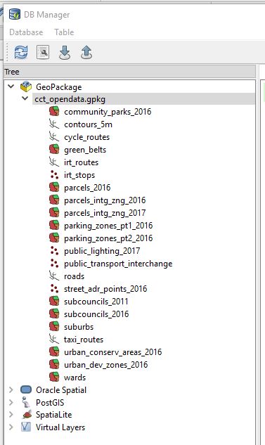
So while scrolling through the data (in Q via DB Manager),I noticed a triangle warning one of the layers did not have a spatial index. I opted to create one as prompted by Q. Q did it behind the scenes I simply had to click a hyperlink.
Using the SQLite Database Browser, we can get more insight into the GeoPackage.
#PostScript
While browsing to the geopackage location. I couldn’t help noticing two extra files
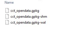
I found out these are temprary files used by SQLite. For a moment I thought the multi-file legacy of the Shapefile was back.
- wal - Write-ahead Log File –*“the purpose of the WAL file is to implement atomic commit and rollback”**
- shm - Shared memory file – *“The only purpose of the shared-memory file is to provide a block of shared memory for use by multiple processes all accessing the same database in WAL mode.”**
I used:
- QGIS 2.18 (DB Manager)
- DB Browser for SQLite 3.10.1
- SublimeText 3.1.1
Refs:
1. FOSS4GNA 2018 Geopackage Presentation
2. Geopackage Website
3. Fulcrum’s Working With GeoData
4. More On GeoPackage
5. SQLite Browser Site
24 May 2018
SCT Part 0
Driven To It
At one geo-software hands-on training I attended. A colleague alluded to the instructor, during feedback time, that it would be great if the training providers used data with a local context. In defence the instructor indicated the concept(s) being taught remained the same. I couldn’t help thinking though how I struggled remembering place names of the data we wrangled. Yes, it had a location but it would have been even better if it were from a place I knew. That somehow takes away a layer of learning hindrance.
I also recently (May 2018) bumped into a job advert for a GIS/Location Intelligence Market Analyst.It was (is) a fascinating job, requiring an intriguing skill set. I struck on the idea of evaluating how well I would fare if I was hired for such a post.[Personal box ticking]. Additionally, constantly in my tweeter feeds. There is much chatter on Data Science, Data Analyst, R, TidyVerse, SQL, JavaScript, Visualisations …[well, must be who I chose to follow, but the fact that I hadn’t unfollowed them was an indication of interest in the topic(s) . ]
So, I will start on a Blog Series - Spatial CapeTown (SCT) with the objective of, well, having a more focused approach to my blogging:
- Improve my writing skills. (Writing tutorials/ reports that are easy to follow).
- Develop and improve work flows while using exclusively FOSS. (So that the workflows are reproducible, software availabiity angle)
- Data massage and honing. (Local context data - the City of Cape Town in particular).
- Improve data analysis and Interpretation skills (Draw insights about the City from the data).
As a spin-off I hope to have fun and quench my insatiable desire for cool visualisations and code in software packages.
The City of Cape Town has a magnificent spatial data viewer from where one can find a ton of information about the city. If you are a tinkeror though, you also want access to the raw data. Frame your own questions and answer them yourself or answer unasked questions while playing with the data . So this series of blog posts is an alternative window to the wealth of spatio-temporal information about the City of Capetown. It will border on data manipulation to statistical inference about matters and phenomena.
On twitter ~ #spatialcct
#PostScript - Disclaimer
The proceeding work is no way authoritative and is purely my work in my personal capacity and not representative of City of Cape Town authority. It is neither official communication nor authoritative data dissemination. Consider it a weekend hack by a fanatic in some garage with data gotten off the internet.
26 Mar 2018
Arc who?
I am a fan of the file geodatabase. Somehow I feel I own the thing and can fire up Q and ogle in there with Open FileGeodatabase. But, enterprise geodatabase, I’m not too sure. While I edited some point data, well, point SDE Feature Class in an *ArcSDE Geodatabase. The machine froze and the software struggled to show selected features. By some stroke of luck I managed to save my edit and exit the program. Relaunch and errr….Where are my points?
Instead of
I get
I commenced in no strategic order troubleshooting why the data was showing all the way up there. The projection, extend and orientation all looked correct. Recalculate extend, Check geometry - No change.
I exported the data to shapefile (yes, back to basics right?). Delete .prj, redefine the projection, still ‘wrong place’. I was still curious to know where on earth, literally, the points fell, if not outer-space.
EPSG_Polygons_Ver_9.2.1.shp from epsg.org was my destination for a projection galore.
The IOGP’s EPSG Geodetic Parameter Dataset is a collection of definitions of coordinate reference systems and coordinate transformations which may be global, regional, national or local in application.

Congo? Jumping all the way up to the Equator, past the Tropic of Capricorn.
I added/ calculated the X,Y fields on the shapefile. The coordinates were as expected but still the points displayed at the ‘wrong place’. Exported the tabular data to the magical csv. Add to the gis software, ‘Display X,Y’. Tada!! Back home.
I imported the data back to the multiuser environment for a trouble free feature class for my team members.
How, why the data behaved this way I am still to know. But, a chase by the hands of time didn’t permit a thorough investigation nor Googling for the right way to fix such an anomaly.
#Postscript
Oftimes QGIS is my go to app for alternative behaviour. This time around nothing was auto-fixed. Imports, exports and tens of arctools in my preferred filegeodatabase sandbox didn’t get this anomaly resolved. It was good remembering that first principles get things done - the x,y coordinate pair is at the heart of geo.
13 Mar 2018
But, why?
queried the Supervisor after I had responded that I had taken a few days off regular work to volunteer. Still I felt it didn’t quite make sense to her. The last time I was at the CTICC (Cape Town International Convention Centre) was seven years earlier. I was meeting a prospective employer to do a hands-on job interview. Long story short, I didn’t get the job but I learnt (from the interviewer) to do a definition query. At that time I was oblivious to the AfricaGeo Conference 2011 which was taking place. The place was abuzz with activity and I feared I would fail to meet my potential job provider.
But this time around I was here for a different agenda.

A Runner Doesn’t Run
As I sat down and scanned the room. The age and mannerisms profile of those gathered started to become apparent. The vibe and increasingly obvious before-now acquaintances who clustered and chatted away strengthened my suspicions. I surveyed the room once more to try and identify contemporaries. Before I could make a count I quickly dropped the exercise as I paid attention to the Program Director who was now welcoming us and introducing key persons.

The team of Volunteers was briefed on what the 17th World Conference on Tobacco or Health was about, how important a role volunteers played and for a longer time, volunteer expectations. I had elected the roles of Runner, Speaker Room and Session Room volunteer. I chose these base ones as I generally appreciate seeing gears moving, literally. High profile roles like team leads and supervisor were not so attractive at this stage.

We got access to the WCTOH2018 Conference Wifi and downloaded the conference app. What an indispensable tool this was. Floor Plans, Session Times, Presenters Profiles and what-not, all a tap of a finger away. ( Surely every conference must be having this - at the back of my mind, Conference = FOSS4G 2018). We were taken around the venue to get oriented to the place and become expert Directionals come conference days. The thorough labelling in CTICC made grasping of what the ‘Venue Guide’ wanted us to remember concrete. Before long we were back in the briefing room to a healthy lunch pack and to receiving directions for the day which followed. The grandeur in design and yet simplistic layout of CTICC lingered as I left the Centre to return on Wednesday. The first day I had chosen to be placed.

Surprised
I reported to my station for the day - The Media Centre. Lanyard, Volunteer Tee on and a bout of enthusiasm abounding. Wednesday was a special day as there was going to be Press Conferences and a key Plenary Session. So access to my station ( that included everyone else) was through a metal detector and security scanner. Eye cast in any direction got you a security officer.
I reported to my contact person, a lovely Matilde who had a game plan ready for execution. A Press Conference was to take place in one of the Session Rooms. Together with my team members we distributed print material for the attendees, made sure the room was ready for use. I carried name tags for the key persons and laid them out on the desk. High-tech Audio-Visual equipment was conspicuous in the room. When the speakers started, a plethora of gadgets started being waved around to capture the moments.
Towards the end of the Press Conference the struggle in my head concluded as I read out one of the speakers’ name label - Michael Bloomberg! I had seen this face many a time on-line and at this moment I was in the same room with this globally renowned man. South Africa’s minister of health, Dr Aaron Motsoaledi among others were also here. What a surprise!

Delegates left the room, we cleared it up and went back to our station. Here we assisted journalists go online and to have a comfortable working space. It was interesting to see how ‘NEWS’ was developed from the Press Conference which had just taken place. News was going out into cyberspace, driven by individuals from various parts of the world, now seated in one room. Literally in minutes, post event.

We hovered in the room churning out print material for upcoming events. Of interest were articles with titles such as ‘For Immediate Release on Wednesday 7 March 2018’. The content of such publication tied congruently with what had just been said in the Press Release.( Someone must surely have published this two page release 1 minute after the Conference had concluded). I had an insight on NEWS propagation.
We also scrapped the web for news coverage of the conference. We printed the relevant articles and furnished our Press Coverage board near the main entrance. My shift concluded quite quickly. When the clock struck 12:30, I had not eaten anything substantial save for a quarter-palm-sized energy biscuit and the cup of coffee I had had circa 6:00. I was too excited to get hungry so had forgone my break. I snacked on the healthy muffin in the lunch bag, contemplating how quickly the first half of the day had gone by. Unfortunately my schedule couldn’t allow me to stay for the Awards Ceremonies which was a big thing and was to take place in the evening.
Three Steps Up
Thursday was supposed to be much calmer than the previous day. So today I was scheduled the Runner Role…but where would I be my Running Base be? I lingered the Deployment Centre (CTICC2, Aloe) to get further instruction from the shift manager.

Fate would have it, I became Co-Supervisor for the day. The person assigned wasn’t coming any more. I was to ‘float’ between the Media Centre and The Speaker Centre. This was my detailed interaction with the speaker centre. This section insured speakers had the resources they needed to present their work. Session Rooms ready to go, Presentations loaded to the virtual space and above all, making sure concurrent Sessions ran flawlessly.
I was briefed by the Co-Head of this section and off I went to explore the entire conference venue as I wished. I roamed from Room to Room checking on my team members - the volunteer crew, manning the Session Rooms. The deployment from Speaker Centre was flawless. The sessions went well. The onsite CTICC technicians making sure audio-visual equipment was impeccable.
09:00 saw a shift in tempo with the volunteers. There was an important Plenary Session taking place in Auditorium I. Every unengaged volunteer stormed A1. It was akin to re-enforcements deployed to where the war was fiercest. You could not find any volunteer idling around in empty session rooms. All hands where on deck ensuring guests sat well in A1 and where rightly directed to it.
The Session went off to a good start. When the Panelist session began, I got one of my great conference takeaway - equipment failure is bound to happen. Inevitable failure. Inspite of capable technicians expertly massaging the dials, the sounds at times just wouldn’t bow. The thought of an ink cartridge running empty trolled the periphery of my thoughts. I watched the technician wince in response to negative feedback from the mic and to epocs of silence as the words of a panelist vanished.
I had my fare share of knowledge impartation from the panel of experts as I kept a watchful eye on the comfort of the attendees. Without doubt the greatest challenge became isle seat occupation. Luckily A1 was big enough to apportion everyone a seat.

The importance of the Speaker Centre became apparent when I had to direct at least three Presenters to the station, who wanted to ensure their ducks were in a row before their presentation time slot.
A Delicate Order
When the session ended volunteers went back to their usual stations - mainly the Session Rooms. During this time slots I was assigned to help with poster take down. Hanne, who was responsible for the section had it figured out. It wasn’t long before all the remaining posters where rolled up for collection by the owners or destined for the recycle bin.
In no time, together with other volunteers we had the appropriate stickers in place for the next Poster Session. The posters were made of a plethora of material, from canvas via rexin to flimsy paper. I got to have a chat with a presenter north of the African Equator! Apparently we helped each other battle a poster off the wall which was more of the perma-stick material. The print service provider he had used had misunderstood his request. This was an Academic Poster not an advertisement. I shared his frustration but, his session had gone well
When the Poster work was done, so was my shift and the conference experience. I headed to the Volunteer Centre, signed out and thanked the volunteer manager for the opportunity. I grabbed the lunch bag as I left CTICC2, thinking to myself, I would do this all over again.

#Postscript
The conference experience should be for every college student and as a volunteer - such and opportune entrant. I had been to user members meetings before and even involved in logistics but, a conference is on another level. So I took the chance and had some takeaways:
-
I should consider learning French. ( Either the bulk of the conference organising team members spoke it or it is truly a global language. )
-
A Runner doesn’t run. It projects a negative image about the conference hosts.
-
Ready or double-ready. Equipment can fail and extra resilience is needed.
17 Aug 2017
Water Waste to Water, Less ?
This is a pseudo-follow-up post to A Point About Points.CapeTown is still in the midst of drought howbeit winter rains bringing some relief. As further mitigation, introducing Level 4b water restrictions from 1 July 2017, were each individual should use 87L per day. With this information all about I could not resist the itch to know where the water sources were in CapeTown, well, geographically that is. The Centre for Geographical Analysis at Stellenbosch University started a satellite image time-series of main dams supplying Cape Town with water. What a brilliant idea! But where were these 6 main (and 8 minor) water sources in the Western Cape? - I sought to answer that.
Think Water, Find Dams

To get me started I got the Dam Names off the City of Cape Town’s Open Data Portal. Search term “dams” yields a csv file of Dam levels, (Dam levels update 2012-2017.csv). This listed all the 14 water supply sources, with storage capacities. I Googled the locations for these and had X, Y coordinates for these.
I planned on having a story map of sorts to help the ‘gazer’ have an idea where the water sources where. I settled for JackDougherty’s template on GitHub. This was particularly attractive because it had LeafletJS in the mix and some GeoJson. My mind was set on the map portion of this excellent visualisation which proved to be too complex to emulate. I also considered Odyssey.js which turned out to be unpolished and kinda project abandoned.
It didn’t take long to have the scrollable map-story for the dams. After following the instructions on the GitHub Repo and editing a few lines in Sublime Text.
See Full Version
Credits
The following sources were used for the Dams Narratives.
-
Cape Water Harvest
-
Hike Table Mountain
-
The Table Mountain Fund
-
Cape Trekking
and the City of Cape Town website for dam capacities.

