07 Jul 2017
Love to Doodle ?
I tweeted a workflow doodle of what I was doing geo-wise on my day job. The workflow aka algorithm, did produce the desired results when I executed it. In retrospect however I self queried if I really had to and if I did enjoy doodling. What was wrong with working with models (ESRI’s Model Builder) on the computer? Was doodling not ‘wasting’ precious time …since I had to recreate the thing in the geo-software later on anyway? Add to that I was the sole workman on this project so I had the liberty to transfer thought to implementation without the need to bounce the idea off a co-worker. Well, white boards are a great idea, especially when there’s need for team collaboration. Not to mention the departure from the boxing effect a computer system/ software tool may have on the thinking process.
The Handicap
Mine wasn’t (isn’t) just a matter of preferring to doodle on papyrus first. I then realised the doodling was born in the past. Dating back to the time I was first introduced to the word processor, Corel Word perfect on a Windows 95 laptop, circa. year 2000. A computer, I was made to believe, …and also observed many treating it so, was a formatter of work. It was meant to make one’s work look neater, cleverer, add fancy text formatting to that and you had a document you could look at and admire the ‘look’ of things, never mind the worth of what was being presented. So I would spend hours, writing out stuff on paper first for later transfer unto ‘The Computer’. (…well call it electronic typewriter).
The idea that a personal computer was a tool, crept in two years later when I was introduced to programming..in Pascal. Only then did it start to dawn that you could have additional text on the screen as you interacted with the PC. But then, PCs at the College were communal, so back to doodling again…for when I get a chance at the keyboard.
So that’s how I fell in love with doodling. One shouldn’t take their mistakes with to the computer you see. So in working the habit off, it’s let’s muddle on the machine. It is a tool and It’s not like it may explode or anything.
21 Apr 2017
Point or Line?
The City of Cape Town on 27 February 2017 released a list of the top 100 water consumers in the city. Cape Town lies in a water-scarce region and is (Q1, 2017) in the grip of a severe drought. Among other measures like water usage restrictions, part of mitigating the water crisis in the city was the publication of the list of ‘heavy users’ above. Several media houses ran with the story (and list) with some including a points map of these water users’ streets.
The top water wasters were named by street name and not street address.The ‘offenders’ points maps (I’ve come across) serve an excellent purpose in pinpointing the location of the subject street. A point however, gives the impression of ‘on-this-spot’.There is also as attribute of the point, the subject street name to aid the map user. Still a point map exposes our species of gazers to misinterpretation. The camouflaged water users cannot be quickly and easily identified via some buffer of the points plotted but rather by buffering the entire ‘offenders’ street. The offending household lives ‘along-this-street’ and not ‘around-this-point.’
Well, enough read? You can - Cut To The Chase
For The Love Of Eye-Candy
Well, I’ve learnt (and came to realise it too) that the value of spatial data decreases with the passage of time but, does good cartography follow the same trend? (discussion for another day). But for the love of better cartography I decided to come up with an improved version of the Top 100 Water Users Map.
Get The List
I got the list from the News24 Wesbsite. From the way it was formatted, I quickly concluded this would be a good candidate for CSVs. 100 lines in Notepad++ is not a lot to manipulate and format.
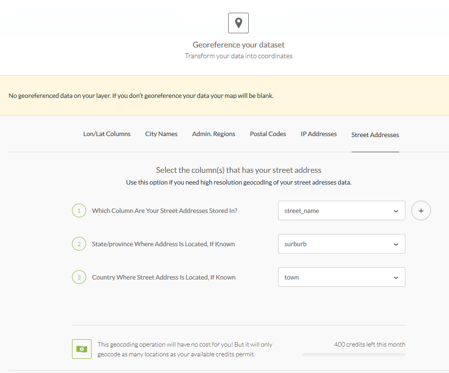
Make It Geo
Address geocoding used to be a costly and rigorous process. Nowadays there are several options to turn address descriptions to vector data. QGIS has the GeoCode option with the MMQGIS ‘Plugin’. Since I had determined to have the data visualised in CARTO, I moved the streets data to there for address geocoding. In seconds I had points!
So in minutes I had the same Points Map as the media houses!
On inspecting the point data - Look, Spatial Duplicates! This would slip the untrained eye when looking at text data, especially that sorted/ranked by consumption. This is where spatial representation shines. The following duplicates(street wise) were found;
89.Hofmeyr Street‚ Welgemoed - 143 000 litres
94.Hofmeyr Street‚ Welgemoed - 123 000 litres
4.Upper Hillwood Road‚ Bishop’s Court - 554 000 litres
71.Upper Hillwood Road‚ Bishop’s Court - 201 000 litres
23.Deauville Avenue‚ Fresnaye - 334 000 litres
29.Deauville Avenue‚ Fresnaye - 310 000 litres
100.Deauville Avenue‚ Fresnaye - 116 000 litres
69.Sunset Avenue‚ Llandudno - 204 000 litres
95.Sunset Avenue‚ Llandudno - 122 000 litres
46.Bishop’s Court Drive‚ Bishop’s Court - 236 000 litres
97.Bishop’s Court Drive‚ Bishop’s Court - 119 000 litres
This ‘repeat’ of a street name changes the way the data would be represented. For Hofmeyr Street for instance, the combined consumption would be 266 000 litres. Since consumption is presented by street name.(At the back of our minds cognisant of the fact that the data was presented by street to mask individual street addresses. )
The geocoding in CARTO was also not 100% (would say 95% accurate). I had to move a few point to be exactly over the subject street in the suburb. Not CARTO’s geocoder’s fauly at all. My data was roughly formatted for a relly good geocode success hit.
Street = Line
Now to get my streets (spatial) data, I headed over to the City of Cape Town Open Data Portal. Road_centrelines.zip hordes the street vector data.
In CARTO I exported the points data, to be used to identify the street ‘line’ data.
Within QGIS, the next task was to select the subject streets, being guided by the points data. The (un)common spatial question:
Select all the streets (lines) near this point (having the same street name).
To answer the above question, a ‘Select by Attribute’ was done on the street geo-data. Formatting the expression with the 100 street names was done in a text editor (Notepad++) but the expression executed in QGIS. Some subject streets (e.g GOVAN MBEKI ROAD) spanned more than one suburb and these had to be clipped appropriately. Again I headed over to the City of Cape Town Open Data Portal to get the Suburbs spatial data (Official planning suburbs 2016.zip).
I used these to clip the road segments to the corresponding suburbs. I further merged small road sections to ease the process of assigning attributes from the point to the streets. A field to store the combined consumption for that street was also created.
A Buffer operation of the points data was done followed by a Join Attributes by Location operation to transfer attributes from the points to the line. An edit was made for the spatial duplicates to sum the consumption totals.
The streets vector data (lines) will not have Usage Position assigned to them. The data has been aggregated and totals for a street are now in use. This reduces the data count from 100 to 93 ( 6 repeats , 1 not found street).
Show It
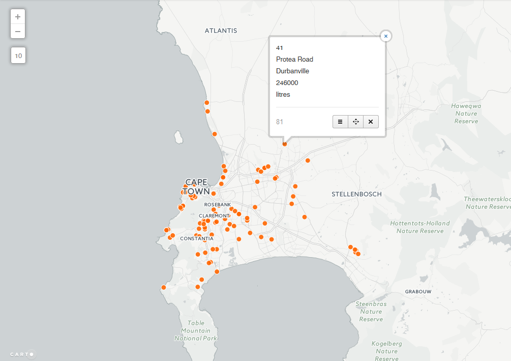
Back to CARTO, I imported the edited streets data for mapping and styling. Wizards in CARTO make mapping trivial for the user. The resultant map below -
I chose the Darkmatter background inorder to highlight the subject streets. A on-hover Info window option was chosen in keeping with the ‘gazing species’.
Perhaps Areas (Polygons) ?
I am somewhat satisfied with the way the data looks represented as lines (read - streets). Strong point being - a line forces one to scan its entire length. While with a point, it immediate vicinity. There’s still some discontentment with the way the lines look - ‘dirtyish’, but then that is the reality of the data. There are several flaws such a visualisation:
- The length of a subject street gives the impression of higher water usage.(Colour coding of the legend attempts to address that.)
- Chances are high a would be user associates the ‘lines’ with water pipes.
- On first sight, the map doesn’t ‘say’ intuitively what’s going on.
This leads me to Part B - “Maybe it’s better to have property boundaries along the street mapped for the water usage”.
#postscript
- Good luck finding Carbenet Way‚ Tokai! (Looks like a data hole to me.)
- With the data wrangling bit, street names such as FISHERMAN’S BEND were problematic dealing with the 's
- CCT open data portal could imporove on the way data is downloaded. Preserving the downloaded filename for instance and other things.
05 Apr 2017
Make Me A Map
Oft in my day job I get requests to map data contained in spreadsheets. I must say I prefer ‘seeing’ my (now not) spreadsheets in a GIS Software environment - TableView. So I quickly want to move any data I get to that place. The path to such and eventually the cartographic output is rarely straight forward, springing from the fact that:
- Most data cells are merged to make the spreadsheet look good.
- Column (field) names are rarely database friendly. (Remember the Shapefile/ DBF >10 characters limit?)
- Something is bound to happen when exporting the data to an intermediate format - CSV - for manipulation. (Data cells formatting.)
- Not forgetting the unnecessary decimal places at times.
The map requester often wonder why I’m taking so long to have their maps ready. In the meantime I have to deal with a plethora of issues as I wrangle the data:
- Discovering that some field names chosen by the client are reserved words in “My GIS” - [ size, ESRI File Geodatabase ]
- The tabular data can’t be joined to the spatial component straight-on because:
- A one-to-one relationship doesn’t exist cleanly because the supplied data contains spatial duplicates but unique attribute data. (What to retain?)
- The supposed common (join) field of the source data doesn’t conform to the format of my reference spatial dataset.
- Some entries of the common field from the master data, contain data that does not fall within the domain of the spatial - e.g a street address such as 101 Crane Street, where evidently street numbers are only 1 - 60. (and 01,10 and 11 exist in the database - in case you’re thinking about a transcribing error.)
Frustration from the Client is understandable. The integrity of their data has come under scrutiny by the Let-The-Data-Speak dictate of data processing and cleaning. Unfortunately they have to wait a bit longer for their map. The decision on how to deal with the questionable data lies with them. I simply transform, as best as I can, to a work of map art.
Database Again Please
… entry level Data Scientists earn $80-$100k per year. The average US Data Scientist makes $118K. Some Senior Data Scientists make between $200,000 to $300,000 per year…
~ datascienceweekly.org, Jan 2017
Working with and in geodatabases makes me somewhat feel like I’m getting closer to being a data scientist. So as I resolved for year 2017 - more SQL (…and Spatial SQL) and databases.
Importing spreadsheets to an ESRI’s Geodatabase has major advantages but isn’t straightforward either. The huge plus being able to preserve field names from source and do data check things. Good luck importing a spreadsheet without first tweaking a field or two to get out of the way ‘Failed To Import’ errors.

Comma Separated Values (CSV) always wins but, beware of formatting within the spreadsheet. If wrongly formatted…Garbage In! But once the import is neatly done, I can comfortably clean data for errors and check integrity better in My GIS environment. As a bonus I get to learn SQL too. Cant’ resist that pretty window!

#postscript
The above are just a few matters highlighting what goes behind the scenes in transforming a spreadsheet to a map. The object to show the non GIS user it takes more than a few clicks to come up with a good map.
11 Feb 2017
Still Looking ?
GIS Specialist
I am in the habit of Googling “GIS” job openings, first in my province of residence and then nationally. CareerJet and Gumtree are my go-to places. CareerJet is particularly good in that it aggregates posts from several job sites. Job Insecurity? ~ far from it! I like to know how my industry is doing, job wise, and also just to check how employable and relevant I still am, a check against having decanted skills and a way of identifying areas of personal improvement. During this insightful ‘pass-time’ activity I couldn’t help notice one particular job that persistently appeared in my searches, albeit evidently being re-posted , for more than 1 year!
Well, as usual you may ~ Cut To The Chase.
Yardsticking
For the particular job above, I felt I was comfortable enough with the requisite skills to dive in. In some areas I wasn’t 100% confident but was sure I could learn on the job in no time (if the prospective employer had such time. But looking at 1 year of advertising? ~ the solution they had in place was good enough for now and could afford to wait before migrating it. Anyway…). I hit upon the idea of preparing myself as if I was to take such a job. As a spin off I decided to aggregate ten “GIS” jobs within South Africa I thought were cool and get a sense of what was commonly being sought.
Add to it, during the beginning of the year I had come across a great post on what an Entrepreneur was and that an individual should be one at their workplace. This was going to be my aim in 2017. I was off to a good start with How Do I Get Started In Data Science from which I had also taken a hint on doing ‘job analysis’. So this year I would list skills I wanted to develop and improve on and work on these through the year. My quick list;
- Improve on my SQL chops . . .SpatialSQL.
- Improve on JavaScript . . . for WebMapping
- Learn Python . . .for scripting.
- Dig a little deeper into PostGRES (..and PostGIS) Admin
- Play more with an online web GeoServer on Digital Ocean or OpenShift.
So I’ll see how that compared with what the market required.
Compassing It
GIS Jobs are variedly titled! For the same tasks and job description you find different banners in use. During this ‘pseudo’ job hunt I quickly discovered that GIS Developers were in demand. I ignored the curiosity to find out more and focus on what I was sure was comfortable with. Just avoiding the small voice in the head saying ‘You must learn software engineering, have some software development experience, learn Java, master algorithm design….’.STOP! The search string for all jobs was simply “GIS”.
I chose the following job postings for the exercise.
- GIS Specialist
- GIS Engineer
- GIS Fascilitator/Manager
- Head GIS and Survey
- Senior GIS Specialist
- Senior GIS Analyst
- GIS Business Analyst
- GIS Specialist
- Economic Development and GIS Data Quality Researcher
- Business Analyst (GIS)
A Play On Words
To complete the exercise, I aggregated all the text used in the above job posts (skippping stuff like email your CV to..blah blah). The aim was to have a sense of responsibilities given and skills sought.
I plugged the combined text from the ten job posts and plugged them into Word ItOut for a word cloud. Why? The thing just looks nice doesn’t it? Seriously. As an aside I figured the larger sized words mean that they appears more often ~ viz is what potential employees are looking for in candidates. After the first run I found some not so useful words appearing often. I pre-processed the combined text - removing words like - South Africa, Salary, City,…I finally ended up with:
My text from job posts had 1051 words. With a minimum frequency of 5 words, 95 words were displayed on the word cloud.
All Words Count

For overkill I also created a 10 word ‘summary’
10 Word Cloud

Last Word
Interestingly, the technical terms are obviated by words like team, development, support e.t.c. SQL doesn’t feature as I guessed it would. Development and experience are dominant. Employers must be looking for persons with systems/ procedures setup skills (Skills is mentioned significantly too!). These positions are likely non entry level kind, requiring experience. For now I’ll stick to my quick list above for skills development and give less weight to results from this exercise.
#postscript
- This surely is not the best way to do a trend analysis of job requirements. I figure something that crawls the web and scraps job sites by South Africa domain names is the way to go. The method used here is rudimentary and creates a cool word cloud graphic to paste on some wall.
- Results from this exercise didn’t produce the Wow! Effect one would get from a visualisation. It wasn’t what I expected at all. The black box spewed something off what I expected. To see that SQL didn’t make it to the word cloud? Where is database?
14 Jan 2017
The Spatio-bias
Granted, after a time, one tends to want to explore the place they’re at in greater detail, just to soothe the curiosity itch. For me the preceding sentence is interpreted - “one tends to want to map the area around them”. Data flowing off @cityofctalerts (City of CT Alerts) was a great candidate for such an ‘itch-scratcher’.
The thought of an CCT Alerts App that had some geofence trigger of sorts kept strolling the helm of my mind. How citizens of the city could benefit such an App;
CCT Alerts Tweet: Electric Fault in Wynberg. The Department is attending.
App User’s Response: Let me drive to the nearest restaurant - can’t really be home and cooking at the moment.
Pardon me, I’m not an App developer(yet). So off to . . . Mapping!
Well, in following the format of this blog posts - TL;DR a.k.a - Cut To The Chase !
Baking The Base
I’ve had my fair share of trouble with shapefiles, from corrupted files to hard-to-read field names. So I have since started experimenting with other spatial data formats - spatialite became the playground for this exercise.
I read up on the cool format here and followed clear instructions on how to start off with and create a spatialite database from within QGIS.
Building Blocks
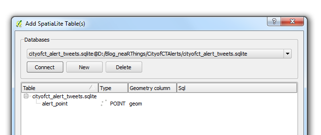
Without repeating the excellent tutorial from the QGIS Documentation Site. Here’s what my parameters where:
- Layer name: alert_points
- Geometry name: geom
- CRS: EPSG:4326 - WGS84
- Attributes:
| category |
tweet_text |
cleaned_tweet |
| TEXT |
TEXT |
TEXT |
I chose to start with these three fields and see how everything evolved in the course of the project.
Before I toiled with my points data layer any further. I opened the database using QGIS’ DB Manger. Lo and behold!
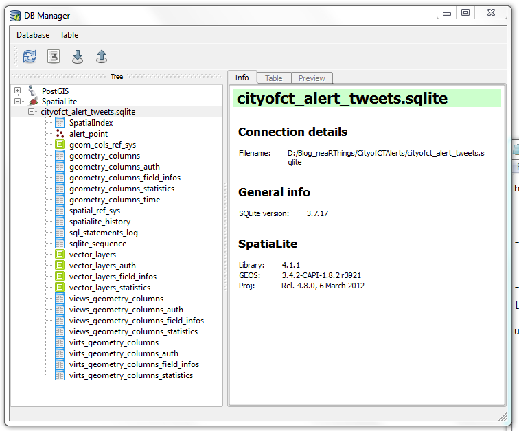
I had not made those many tables (or are they called relations?). It must have been some ‘behind-the-scenes’ operation. How the SQLite DB gets to function. I ogled the SQLite version 3.7.17, the current version is 3.10.2 (2016-01-20). I was using using QGIS 2.8.2 -Wien (Portable Version).
To add to the fun I downloaded spatialite_gui_4.3.0a-win-amd64.7z from here. Extracted with WinRar and the eye-candy…
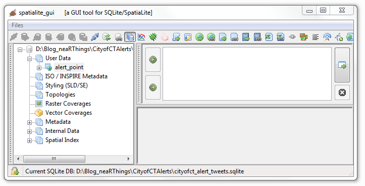
This was just overkill. QGIS is quite capable of handling everything just fine.
Data Collation
Next was the collation of data from twitter. The mention of road and suburb names in the tweets was assurance most of the tweets could be geolocated (well… geotagging in retrospect). I chose to start on 1 January 2016. The plan being to gather the tweet stream for the whole year. I would work these on a per-month basis; February tweets collated and geocoded in March and March tweets collated and geocoded in April and so forth.
I thought about data scrapers, even looked at Web Scrapper but, somehow I couldn’t get ahead. I went for ‘hand-scrapping’ the tweet data from Tweettunnel which changed during the course of the year (2016) to Omnicity. This data was input to an MS Excel spreadsheet for cleaning albeit with some serious Excel chops.
I would copy data for a specific day, paste in MS Excel, Find and Replace recurrent text with blanks, then delete the blank rows. Used hints on deleting blank columns and another clever tip on filtering odd and even rows. The tweet text was properly formatted to correspond with the time.
One of the magic formulas was
Precious Time
A typical tweet captured 08:17 read
The electrical fault in Fresneay affecting Top Rd & surr has been resolved as of 10:10.
The webtime reflected on the tweet, 08:17 is apparently 2 hours behind the tweet posting time. Adjustment had to be made for the shift. Formula adopted from here.
Some tweets were reports of the end of an event (like the one above). After aggregating response times, 2 hours was found to be the average life time of an event. Thus events/ incidences whose end times was reported, were projected to have started two hours earlier.
Importing a ‘flat file’ table into a database is easy and having a text file for an intermediate format works wonders. I formatted my spreadsheet thus:
| Field Name |
Field Description |
| Incident_no |
Reference id |
| time_on_twitter |
Time tweet was made |
| projected_start |
Time the event started. Assumed to be the time of the tweet. |
| event_end |
Time the event ended. Tweet time as appears on scrapped site. |
| full_tweet |
Tweet as extracted from start. |
| category |
Classification of tweet (traffic, water, electric, misc) |
| projected_start_prj |
Indicator as to whether the start time was interpolated or not (TRUE/ FALSE field) |
| event_end_prj |
Indicator as to whether the event end time was interpolated or not (TRUE/ FALSE field) |
| true_event_start |
The start time adjusted to the local time (the 2 hr shift of the scrapped site) |
| true_event_end |
The end time adjusted to the local time (the 2 hr shift of the scrapped site) |
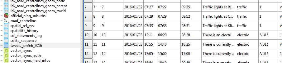
Some tweets were repeated, especially on incident resolution. These were deleted off the record to avoid duplication. I also noticed that the majority of the tweets were traffic related.
Where Was That ?
The intention of the exercise was to map the tweets and animate them in time. The idea of a geocoder to automate the geocoding occurred to me but, seeing the format of the tweets, that was going to be a mission. It appeared tweets were made from a desk after reports were sent through to or an observation was made at some ‘command centre’.
Next up was importing my ‘spreadsheet record’ into the SQLite database - via an intermediate csv file.
Representing time was no mean task since “SQLite does not have a separate storage class for storing dates and/or times, but SQLite is capable of storing dates and times as TEXT, REAL or INTEGER values “(source). So I went for text storage, knowing CartoDB would be able to handle it.
For kicks and to horn my SQL Skills I updated categories field from within the SQL Windows of DB Manager within QGIS. Now this I enjoyed, kinda answered my question why IT person cum GIS guys insist on Spatial SQL!
####Getting Reference Data
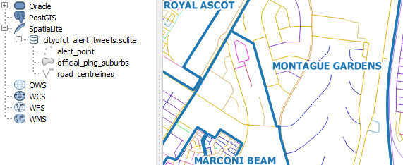
To geocode the tweets, geographic data is required. Fortunately the City of Cape Town has a Open Data Portal. I searched for road data and got me - Road_centrelines.zip. The site has great metadata I must say. I also got the suburbs data - Official_planning_suburbs.zip
To add to the fun, I loaded the shapefile data into my spatialite database via QGIS’s DB Manager. A trivial process really but, my roads wouldn’t show in QGIS! This was resolved after some ‘GIYF’, turned out to be some Spatial Index thing.
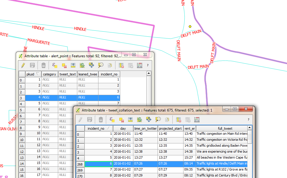
Next was mapping the tweets. With the database of tweets, roads and suburbs loaded in QGIS. The task was to locate event points on the map. To relate the record of tweets and event locations, I chose a primary key field of sequential integer numbers. (I good choice? I self queried. A co-worker at another place had retorted “you don’t use sequential numbers for unique identifiers” - I dismissed the thought and continued ).
Here’s the procedure I followed for geolocation:
- Interpret the tweet to get a sense of where the place would be.
- Using the Suburbs and Road Centrelines (labelled), identify where the spot could be on the ground.
- Zoom to the candidate place within QGGIS and with the help of a satellite imagery backdrop, created a point feature.
- Update the alert_point Incident_no field with the corresponding Incident_no in the tweets_collation table.
Spoiler Alert: I kept up with this until I got to 91 points. At this point I decided I just didn’t have time to geocode a year’s worth of tweets. I would still however take the sample points to a place where the project could be considered successfully competed. So I continued…
Attributes to Points
Next up was merging the tweets record and the points geocoded in the sqlite database.
First instinct was to search QGIS’s Processing Toolbox for attributes and sure enough there was a join attributes table tool. Filling in the blanks was trivial.
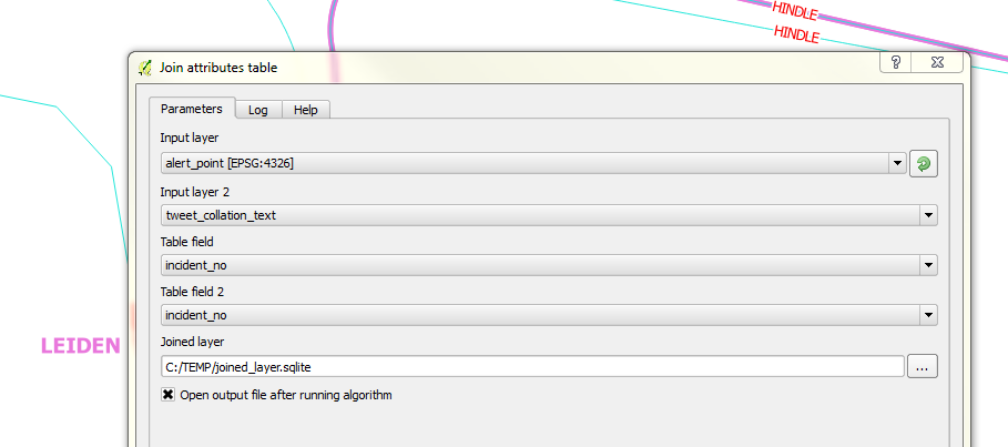
Catch: To illustrate a point and get the graphic for this blog post representative, I had selected the corresponding record in the points layer. So, when I ran the join tool, only one record, the selected one came up for a result! I had to re-run the tool with no active selections. Additionally the join tool creates a temporary shapefile (if you leave the defaults on) after the join and disappointingly with shapefiles- long field names get chopped. To escape this, specify the output to sqlite file.
I wanted to have my resultant join point data in my SpatiaLite database so I attempted a Save As operation to the database and it didn’t work. So using DB Manager, I imported the Joined layer , Renaming it cct_geolocated_tweets in the process and voila. The joined data with all the field names intact.
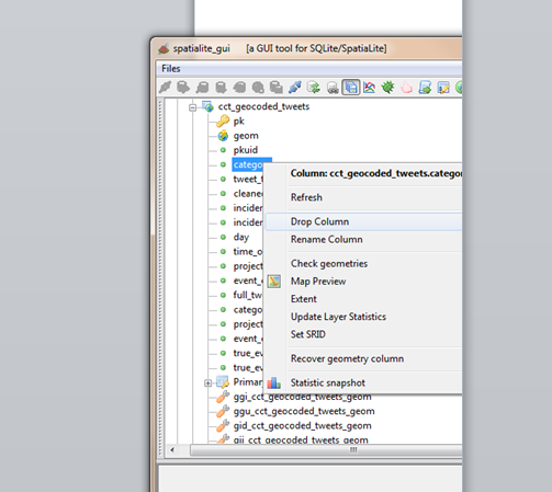
I did additional data cleaning, deleting empty fields in my working layer. Table editing of spatilite tables in QGIS didn’t work so I tried again using SQL in DB Manager.
ALTER TABLE cct_geocoded_tweets
DROP COLUMN category;
Still no success. I kept getting a ‘Syntax Error’ message. I would try things in Spatialite GUI. Still after several chops in SQL nothing worked…I kept getting the same Syntax error. It was time to ask for help. My suspicion of no edit support in QGIS was confirmed and I got the solution elsewhere.
Tweets To Eye Candy
The fun part of the project was to animate the tweets in CartoDB. Since I had previous experience with this.I re-read my own blog post on the correct way to properly format time so that CartoDB plays nice with the data.
Timing The Visual
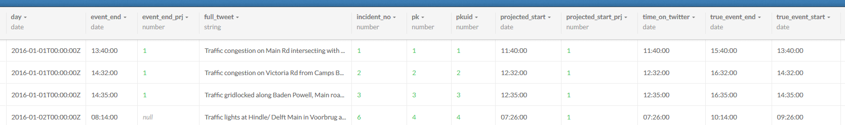
Next was to export the data into CartoDB to start with the visualisation. As I started I figured the following attributes about the data would be required to make the visualisation work.
| Field Name |
Field Description |
| Incident Start Time |
The moment in time the incident/ event occured. |
| Incident Duration |
How long the event lasted. (Incident End Time) - (Incident Start Time) |
| Longitude |
Make the data mappable. |
| Latitude |
Make the data mappable. |
SpatiaLite stores the geo data as geometry and Carto won’t ingest sqlite data. The go to format was again CSV. In QGIS the data was updated for Lat, Lon fields. A matter of adding Latitude and Longitude fields via a scripted tool in the Processing Toolbox.
Within Spatialite_GUI, I exported the tweets relation to csv for manipulation in Carto.
In Carto I imported the CSV.
Carto provides a simplistic yet powerful ‘work benches’ for the spatial data. Auto magically, Carto assigns data types to fields after interpreting the data it contains.
Next, I wanted to have time fields setup for eventual mapping. For fun - I’ld do the data manipulation in Carto.
I aimed at creating a new field, event_time, similarly formatted like day (with date data type). This would be a compound of (day) + (true_event_start). A second field event_duration = (true_event_end) - (true_event_start). So within Carto’s SQL window, I created event_time
ALTER TABLE cct_geocoded_tweets
ADD event_time date;
ALTER TABLE cct_geocoded_tweets
ADD event_duration interval;
Now to populate the time fields:
UPDATE cct_geocoded_tweets SET event_time = day + true_event_start;
The above didn’t start without some research. Time manipulation in databases is not straight forward. From the syntax highlighting in Carto, I figured day was a reserved word, so I changed my field from day to event_day to avoid potential problems. I had to change event duration to interval inorder to make the sql time math work okay.
ALTER TABLE cct_geocoded_tweets
ADD event_day date;
UPDATE cct_geocoded_tweets SET event_day=day;
Detour: After discovering that time manipulation with SQL is much more complex than meets the eye. I decided to revert to familiar ground - choosing to format the times fields within a spreadsheet environment. And after several intermediate text manipulations, I ended up with event_time formatted thus YYYY-MM-DDTHH:MM:SSZ and event_duration, thus HH:MM. I then imported the new csv file into Carto.
The Visualisation
After inspecting the imported csv file in DATA VIEW view, I switched to MAP VIEW to see how things would look. Carto requested I define the geometry fields - an easy task for a properly formatted dataset.
On switching to MAP VIEW Carto hints that 11 interesting maps were possible with the data! How easy can mapping be?! I chose Torque on event_time ANIMATED. I started the Wizard to see what fine tuning I could do, basing on parameters I had used in my previous exercise. I finally settled for the following:
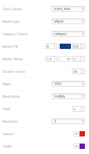
The Chase
Having flickering points only is not sufficient for other insights, such as looking what the event was about. For that I made another map - where one can probe the attributes. Hover a point to see entire tweet text and Click to see extra information like event duration.
#postscript
-
A great follow-up exercise would be to automate the scrapping of the @cityofctalerts (City of CT Alerts) twitter stream. This would quickly build a tweets database for subsequent geocoding.
-
Semi-automate the geocoding of the tweets by creating a roads and place gazetteer of sorts. This would quicken the geo-coding processing. Grouping tweets, thus narrowing the search area for geocoding.
-
Most likely Transport for CapeTown has something going already but, this exercise’s approach fosters ‘srap-your-own-data-out-there’.
-
Google Maps tells of traffic congestions and related road incidents so will also likely have great data horde as relates to traffic information.

