

A Relevant Tweet - City of CT Alerts
14 Jan 2017The Spatio-bias
Granted, after a time, one tends to want to explore the place they’re at in greater detail, just to soothe the curiosity itch. For me the preceding sentence is interpreted - “one tends to want to map the area around them”. Data flowing off @cityofctalerts (City of CT Alerts) was a great candidate for such an ‘itch-scratcher’.
The thought of an CCT Alerts App that had some geofence trigger of sorts kept strolling the helm of my mind. How citizens of the city could benefit such an App;
CCT Alerts Tweet: Electric Fault in Wynberg. The Department is attending.
App User’s Response: Let me drive to the nearest restaurant - can’t really be home and cooking at the moment.
Pardon me, I’m not an App developer(yet). So off to . . . Mapping!
Well, in following the format of this blog posts - TL;DR a.k.a - Cut To The Chase !
Baking The Base
I’ve had my fair share of trouble with shapefiles, from corrupted files to hard-to-read field names. So I have since started experimenting with other spatial data formats - spatialite became the playground for this exercise.
I read up on the cool format here and followed clear instructions on how to start off with and create a spatialite database from within QGIS.
Building Blocks
Without repeating the excellent tutorial from the QGIS Documentation Site. Here’s what my parameters where:
- Layer name: alert_points
- Geometry name: geom
- CRS: EPSG:4326 - WGS84
- Attributes:
| category | tweet_text | cleaned_tweet |
|---|---|---|
| TEXT | TEXT | TEXT |
I chose to start with these three fields and see how everything evolved in the course of the project.
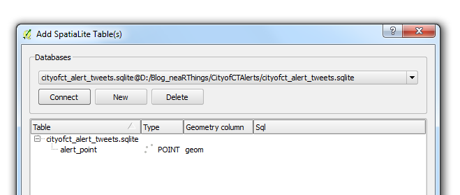
Before I toiled with my points data layer any further. I opened the database using QGIS’ DB Manger. Lo and behold!
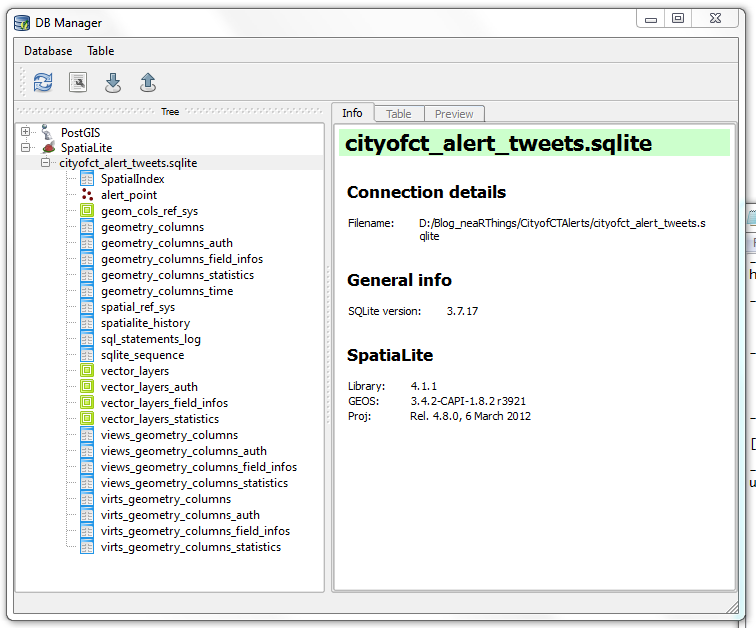
I had not made those many tables (or are they called relations?). It must have been some ‘behind-the-scenes’ operation. How the SQLite DB gets to function. I ogled the SQLite version 3.7.17, the current version is 3.10.2 (2016-01-20). I was using using QGIS 2.8.2 -Wien (Portable Version).
To add to the fun I downloaded spatialite_gui_4.3.0a-win-amd64.7z from here. Extracted with WinRar and the eye-candy…
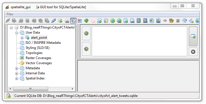
This was just overkill. QGIS is quite capable of handling everything just fine.
Data Collation
Next was the collation of data from twitter. The mention of road and suburb names in the tweets was assurance most of the tweets could be geolocated (well… geotagging in retrospect). I chose to start on 1 January 2016. The plan being to gather the tweet stream for the whole year. I would work these on a per-month basis; February tweets collated and geocoded in March and March tweets collated and geocoded in April and so forth.
Scrapping The Tweet
I thought about data scrapers, even looked at Web Scrapper but, somehow I couldn’t get ahead. I went for ‘hand-scrapping’ the tweet data from Tweettunnel which changed during the course of the year (2016) to Omnicity. This data was input to an MS Excel spreadsheet for cleaning albeit with some serious Excel chops.
I would copy data for a specific day, paste in MS Excel, Find and Replace recurrent text with blanks, then delete the blank rows. Used hints on deleting blank columns and another clever tip on filtering odd and even rows. The tweet text was properly formatted to correspond with the time.
One of the magic formulas was
=MOD(ROW(A2),2)=0
Precious Time
A typical tweet captured 08:17 read
The electrical fault in Fresneay affecting Top Rd & surr has been resolved as of 10:10.
The webtime reflected on the tweet, 08:17 is apparently 2 hours behind the tweet posting time. Adjustment had to be made for the shift. Formula adopted from here.
=Row A + Time(HH,MM,SS)
Some tweets were reports of the end of an event (like the one above). After aggregating response times, 2 hours was found to be the average life time of an event. Thus events/ incidences whose end times was reported, were projected to have started two hours earlier.
Tweet Record
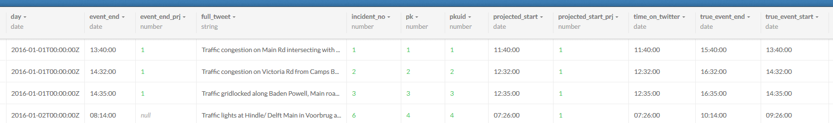
Importing a ‘flat file’ table into a database is easy and having a text file for an intermediate format works wonders. I formatted my spreadsheet thus:
| Field Name | Field Description |
|---|---|
| Incident_no | Reference id |
| time_on_twitter | Time tweet was made |
| projected_start | Time the event started. Assumed to be the time of the tweet. |
| event_end | Time the event ended. Tweet time as appears on scrapped site. |
| full_tweet | Tweet as extracted from start. |
| category | Classification of tweet (traffic, water, electric, misc) |
| projected_start_prj | Indicator as to whether the start time was interpolated or not (TRUE/ FALSE field) |
| event_end_prj | Indicator as to whether the event end time was interpolated or not (TRUE/ FALSE field) |
| true_event_start | The start time adjusted to the local time (the 2 hr shift of the scrapped site) |
| true_event_end | The end time adjusted to the local time (the 2 hr shift of the scrapped site) |
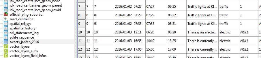
Some tweets were repeated, especially on incident resolution. These were deleted off the record to avoid duplication. I also noticed that the majority of the tweets were traffic related.
Where Was That ?
The intention of the exercise was to map the tweets and animate them in time. The idea of a geocoder to automate the geocoding occurred to me but, seeing the format of the tweets, that was going to be a mission. It appeared tweets were made from a desk after reports were sent through to or an observation was made at some ‘command centre’.
Next up was importing my ‘spreadsheet record’ into the SQLite database - via an intermediate csv file.
Representing time was no mean task since “SQLite does not have a separate storage class for storing dates and/or times, but SQLite is capable of storing dates and times as TEXT, REAL or INTEGER values “(source). So I went for text storage, knowing CartoDB would be able to handle it.
For kicks and to horn my SQL Skills I updated categories field from within the SQL Windows of DB Manager within QGIS. Now this I enjoyed, kinda answered my question why IT person cum GIS guys insist on Spatial SQL!
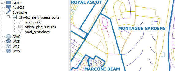
####Getting Reference Data To geocode the tweets, geographic data is required. Fortunately the City of Cape Town has a Open Data Portal. I searched for road data and got me - Road_centrelines.zip. The site has great metadata I must say. I also got the suburbs data - Official_planning_suburbs.zip
To add to the fun, I loaded the shapefile data into my spatialite database via QGIS’s DB Manager. A trivial process really but, my roads wouldn’t show in QGIS! This was resolved after some ‘GIYF’, turned out to be some Spatial Index thing.
Tweets To Places
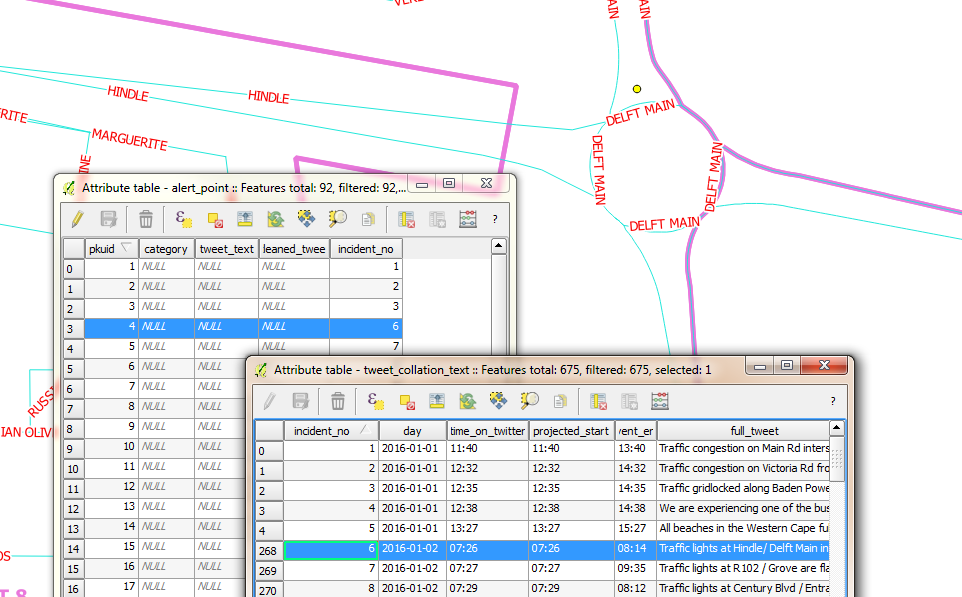
Next was mapping the tweets. With the database of tweets, roads and suburbs loaded in QGIS. The task was to locate event points on the map. To relate the record of tweets and event locations, I chose a primary key field of sequential integer numbers. (I good choice? I self queried. A co-worker at another place had retorted “you don’t use sequential numbers for unique identifiers” - I dismissed the thought and continued ).
Here’s the procedure I followed for geolocation:
- Interpret the tweet to get a sense of where the place would be.
- Using the Suburbs and Road Centrelines (labelled), identify where the spot could be on the ground.
- Zoom to the candidate place within QGGIS and with the help of a satellite imagery backdrop, created a point feature.
- Update the alert_point Incident_no field with the corresponding Incident_no in the tweets_collation table.
Spoiler Alert: I kept up with this until I got to 91 points. At this point I decided I just didn’t have time to geocode a year’s worth of tweets. I would still however take the sample points to a place where the project could be considered successfully competed. So I continued…
Attributes to Points
Next up was merging the tweets record and the points geocoded in the sqlite database.
First instinct was to search QGIS’s Processing Toolbox for attributes and sure enough there was a join attributes table tool. Filling in the blanks was trivial.
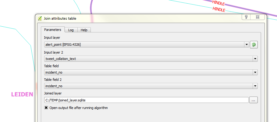
Catch: To illustrate a point and get the graphic for this blog post representative, I had selected the corresponding record in the points layer. So, when I ran the join tool, only one record, the selected one came up for a result! I had to re-run the tool with no active selections. Additionally the join tool creates a temporary shapefile (if you leave the defaults on) after the join and disappointingly with shapefiles- long field names get chopped. To escape this, specify the output to sqlite file.
I wanted to have my resultant join point data in my SpatiaLite database so I attempted a Save As operation to the database and it didn’t work. So using DB Manager, I imported the Joined layer , Renaming it cct_geolocated_tweets in the process and voila. The joined data with all the field names intact.
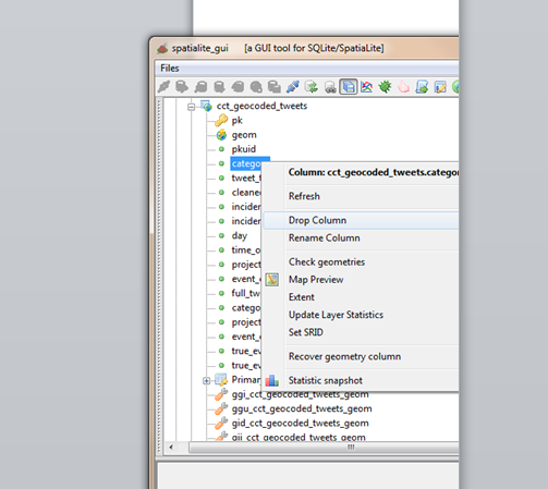
I did additional data cleaning, deleting empty fields in my working layer. Table editing of spatilite tables in QGIS didn’t work so I tried again using SQL in DB Manager.
ALTER TABLE cct_geocoded_tweets
DROP COLUMN category;
Still no success. I kept getting a ‘Syntax Error’ message. I would try things in Spatialite GUI. Still after several chops in SQL nothing worked…I kept getting the same Syntax error. It was time to ask for help. My suspicion of no edit support in QGIS was confirmed and I got the solution elsewhere.
Tweets To Eye Candy
The fun part of the project was to animate the tweets in CartoDB. Since I had previous experience with this.I re-read my own blog post on the correct way to properly format time so that CartoDB plays nice with the data.
Timing The Visual
Next was to export the data into CartoDB to start with the visualisation. As I started I figured the following attributes about the data would be required to make the visualisation work.
| Field Name | Field Description |
|---|---|
| Incident Start Time | The moment in time the incident/ event occured. |
| Incident Duration | How long the event lasted. (Incident End Time) - (Incident Start Time) |
| Longitude | Make the data mappable. |
| Latitude | Make the data mappable. |
SpatiaLite stores the geo data as geometry and Carto won’t ingest sqlite data. The go to format was again CSV. In QGIS the data was updated for Lat, Lon fields. A matter of adding Latitude and Longitude fields via a scripted tool in the Processing Toolbox.
Within Spatialite_GUI, I exported the tweets relation to csv for manipulation in Carto.
In Carto I imported the CSV.
Carto provides a simplistic yet powerful ‘work benches’ for the spatial data. Auto magically, Carto assigns data types to fields after interpreting the data it contains.
Next, I wanted to have time fields setup for eventual mapping. For fun - I’ld do the data manipulation in Carto.
I aimed at creating a new field, event_time, similarly formatted like day (with date data type). This would be a compound of (day) + (true_event_start). A second field event_duration = (true_event_end) - (true_event_start). So within Carto’s SQL window, I created event_time
ALTER TABLE cct_geocoded_tweets
ADD event_time date;
ALTER TABLE cct_geocoded_tweets
ADD event_duration interval;
Now to populate the time fields:
UPDATE cct_geocoded_tweets SET event_time = day + true_event_start;
The above didn’t start without some research. Time manipulation in databases is not straight forward. From the syntax highlighting in Carto, I figured day was a reserved word, so I changed my field from day to event_day to avoid potential problems. I had to change event duration to interval inorder to make the sql time math work okay.
ALTER TABLE cct_geocoded_tweets
ADD event_day date;
UPDATE cct_geocoded_tweets SET event_day=day;
Detour: After discovering that time manipulation with SQL is much more complex than meets the eye. I decided to revert to familiar ground - choosing to format the times fields within a spreadsheet environment. And after several intermediate text manipulations, I ended up with event_time formatted thus YYYY-MM-DDTHH:MM:SSZ and event_duration, thus HH:MM. I then imported the new csv file into Carto.
The Visualisation
After inspecting the imported csv file in DATA VIEW view, I switched to MAP VIEW to see how things would look. Carto requested I define the geometry fields - an easy task for a properly formatted dataset.
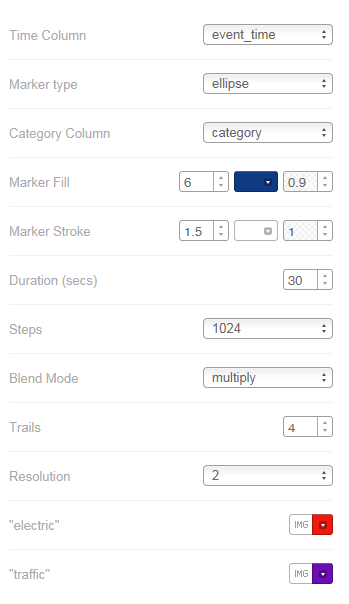
On switching to MAP VIEW Carto hints that 11 interesting maps were possible with the data! How easy can mapping be?! I chose Torque on event_time ANIMATED. I started the Wizard to see what fine tuning I could do, basing on parameters I had used in my previous exercise. I finally settled for the following:
The Chase
Having flickering points only is not sufficient for other insights, such as looking what the event was about. For that I made another map - where one can probe the attributes. Hover a point to see entire tweet text and Click to see extra information like event duration.
#postscript
-
A great follow-up exercise would be to automate the scrapping of the @cityofctalerts (City of CT Alerts) twitter stream. This would quickly build a tweets database for subsequent geocoding.
-
Semi-automate the geocoding of the tweets by creating a roads and place gazetteer of sorts. This would quicken the geo-coding processing. Grouping tweets, thus narrowing the search area for geocoding.
-
Most likely Transport for CapeTown has something going already but, this exercise’s approach fosters ‘srap-your-own-data-out-there’.
-
Google Maps tells of traffic congestions and related road incidents so will also likely have great data horde as relates to traffic information.