

Spatial Doodle - On The Everytime Sensor
18 Dec 2016My Spatial Doodle
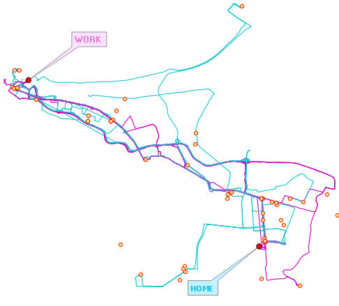
A QGIS dump of track data recorded for 102 days, (Start 2014/08/17; Finish 2014/12/04). 143 GPX Files, total of 375 165 points logged, 250 051 weekday points. With gaps in the data too.
Well, we don’t always have time to read: ..so cut to THE CHASE.
Tracing Where
With smartphones, we’re carrying sensors with us all the time and the GPS (Receiver!) one, tickles a ‘geo-itch’. The exercise of tracking oneself is not new, a great case in point being The Drawing of Our Lives by Belasco and New. Some TL;DR [1], [2].
For a while I had OSM Tracker for Android installed on my phone. So when the idea of tracking my to-work and from-work ‘spatial doodle’ occured, I defaulted to it. (I’ve tried alternative phone-gps-loggers but OSM Tracker came tops.). I started logging the moment I embarked on the ‘taxi/ van’ to work and would stop when I disembarked. The logging frequency was 2 seconds since the taxi moved quite fast and I wanted to leave open the chance of pin-pointing places the taxi stopped to pick-up passengers on any given day and possibly some other whatever ‘time analytics’. I would repeat the procedure after work. Weekend recorded data is also included in this exercise.
Serving Time…GPS Time
Yes! Serving and saving time. I discovered the hard way that GPX data doesn’t play very nice! It’s read super easy by QGIS, but try to export it to shapefile to fiddle with the points and oblivion sucks in the precious Time field, formatted thus 2014-08-17T07:13:26. The intention was to merge the 143 GPX files to have one data file to play with.
There are alternative ways to deal with the GPX data and preserve the Time, like gpx2spatialite. With a Spatialite file (database) better SQL operations can be utilised to delve more insight. But the ‘tinkering’ with Python, again, is too much on I-feel-lazy weekends. So I looked on for alternative solutions. 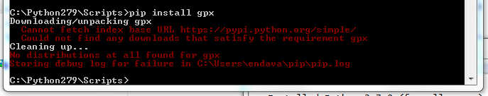
Borrowing Servers
-
Merging The GPS Data
GIYF may seem like an insult when received from someone on social media or such forums, but should be a great maxim to adopt - GIMF. My intention was to compare/ visualise my commute to and from work so I needed a ‘stack of times’ to compare, preferrably in one file. I discovered a tool to merge GPX files online.
Curtesy of GOTOES, Utilities for Strava and Garmin Connect, I got to use this tool to merge my GPX files and I ended up with a ~ 70MB GPX file.
-
Make The Dots Play
I now believe every ‘geospatial’ person should toil with CartoDB at least once. It’s incredibly powerful but trivially simple. The memory of various tweeter and miscellanea visualisations using CartoDB drew me to it and was sure it could handle time.
Like magic CartoDB ingested the GPX! Yielding both the tracks and points data, preserving the ‘dear’ time attribute. Just days before I embarked on my exercise, CartoDB had increased storage space of the free plan from 50MB to 250MB! This was super convenient with the 70MB data I had.
There were lots of fields with null values and these I deleted within CartoDB in DATA VIEW mode. Simple as ‘Delete this column’. I was interested in comparing/ visualising travel time, so had to ignore days (dates). I created a time_a field to contain only the time variable - hour, minute, second. That’s easy in CartoDB - In DATAVIEW, clicking on the fields gives various options, one of which is to create a New Column.
I initially made the time_a field of type string. I was conversant with extracting parts of text from a field so went for that option. Created several intermediate fields applying variants of
UPDATE spatial_doodle_points SET dummy_time = left(dummy_time_a,8);until I got HH:MM:SS. I got a clue from gis.stackexchange to finally properly format the time field
UPDATE spatial_doodle_points SET time_a = to_timestamp(dummy_time, 'HH24:MI:SS');I eventually ended up with a field with values such as -1-01-01THH:MM:SSZ. The consistent auto appended day was fine with me as they made all my data points to fall one one day. I was interested in visualising the time.
Things get interesting when one switches to the Maps View. CartoDB runs a courtesy analysis on the data and gives an inviting “We discovered X interesting maps!” Clicking on SHOW gives suggestions of visualisations on TIME fields.Now how simple can any visualisation app/ service get?
Selecting the VISUALIZE tab takes one to the mapping interface.
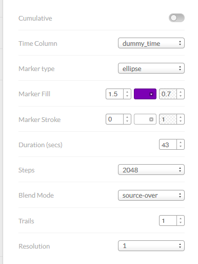
Select Wizards and there’s an option to have Torque visualisations. I finally settled for the parameters as shown after several iterations.
Here Goes
Insights
From the visualisations I could make the following deductions:
- The data visualised is inclusive of weekend doodles.
- I didn’t take the same taxi consistently every morning (06:25 - 07:45) or the taxi was not consistent in its arrival(departure) time. This is evident from the way the dots ‘depart’ from the boarding place.
- There is general consistency in the route the taxi(s) took in the morning. The contrary is true for transport used from work.
- To an extent, traffic flow can be deduced from the ‘to-work’ dots. After a certain point, the dots are evidently ‘faster’.
- On the ‘from-work’ component (post 16:00), there is a larger variation in routes used by the taxi(s). A clear evidence of rat racing as the main routes are avoided.
- There is a section of the main road to work that has a dedicated bus-lane. This however cannot be easily seen from the point data. Track data reveals this better.
- An even more interesting visualisation would have been a race-to-work by day. Say 5 day data, symbolised by day to see the variation between days. Currently CartoDB Torque visualisations accomodate only one dataset.
#postscript
There is on an active repo on GitHub, a CartoDB dockerfile. A goldmine for anyone who wants to explore CartoDB in all it’s glory in one’s palm.