07 Jun 2025
On the ‘5-9’ job I use ESRI software extensively. Over the course of my career I have invested time learning the ins and outs of the software from data capturing , editing to analysis. I set apart regular time to learn how to use the software. Efficiency and increase in productivity also depends on saving on the micro-seconds one spends doing things the inefficient way. So I poured through the HandsOn section of earlier editions of ArcUser’s, gaining much skill, self-training.
Fast forward to date, the organisation is making a switch from ArcMap to ArcGIS Pro because of ArcMap reaching end of life support. Pro has been around for some time now already and understandably, for large organisations making the switch has huge implications on production hence the somewhat ‘slow’ adoption of new technologies - Don’t quickly break what is working at the expense of service delivery. Now though, was the time to migrate.
I knew some advantages of Pro, but the internal resistance was stemming from the comfortable skill level in older software and from the change in software design philosophy from ArcMap to Pro.
Draw me a picture
The past week I spend doing a course, ArcGIS Pro Standard to improve my software skill level. This was not the first time opening the Pro software though. I have had a few months dabbling in the software especially with data management. So I could easily follow the Course Instructor’s lead. In my head though I struggled with how things worked in Pro vs ArcMap. Somewhere three quarters through the course material, everything clicked in place as I understood things my own way. I came up with a hand sketch and from there-on it was smooth sailing…

#Postscript
Huge takeaway, with a solid understanding of GIS concepts, it’s not hard to learn a spatial information manipulation and analysis software . With Pro, the Ribbon concept and context activated tools improve productivity once one knows where is what without having to ‘Search’ - which in it’s right is a must use.
28 Feb 2025

The image above was highlight of an email I received mid-February this year,a few days after I had demonstrated my spatial data visualisation abilities to an interested party. One of my favourite posts which relied on CartoDB came to mind. I got the motivation to preserve this portion of my portfolio of work.
Early Cloud
This made me reminisce all the free, limited use cloud services that scratched a tinkeror’s itch.How at one time I used RedHat’s OpenShift to host GeoServer and ran a PostGIS server on Digital Ocean, just to test the PostgreSQL database connection abilities of QGIS. It is magic to see a table turn to vectors for someone whose background in spatial science is a GIS software environment.


Migrating Maps
The email from CartoDB gave the next steps to the email heading
Your CARTO legacy account will be retired on March 31st, 2025
A new CARTO platform had been launched nearly 4 years earlier (2021).
I determined I was indeed still using the legacy platform. I signed up to the new platform.

Some of my Carto maps.
There were also some Kepler.gl associated maps. These I didn’t care to preserve. Additionally there were datasets, linked to the maps, which needed to be preserved.

Some datasets.
Data Wherehouse
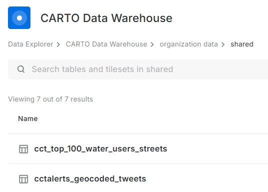
The ‘new’ CARTO platform had some catchy requirements for a tinkeror but, luckily… I could make use of their own Carto Data Warehouse. However, data needed to be migrated and maps to be recreated.
I created an account on the New CARTO platform. Indeed it carries the shiny feel of 2025 web technologies.
- Downloaded datasets from the Legacy account, chose the CSV file format.
- Uploaded the data (7) into the data warehouse connection - Carto Data Warehouse (carto_dw).
- Default import settings on data types are fine but not when time is converted to text.
- I fiddled with TIME, TIMESTAMP and DATE till I had the GPS Logs data correctly formatted.
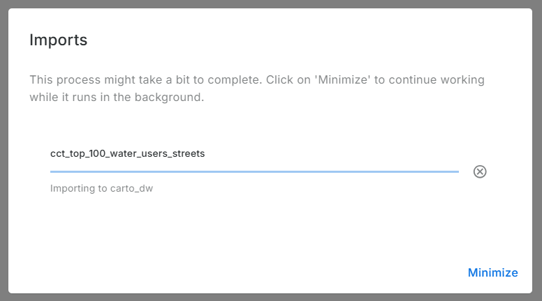
Imported data:
No Yes Visualisation Here
Before spending more effort in coming up with a visualisation, I reviewed Carto’s plans. There is none free there - except trial. So I reluctantly stopped there. Whatever I was going to create here, was going to last for 14 days. Well, I received an onboarding email from Carto while I was still busy with this blog post. I explained that I was not going to complete the migration because there was no (free) plan to meet my use case of the platform. To my delight, Carto responded a few hours later informing my plan had been migrated to CARTO Cloud Native. So finally, my visualisations can be preserved.
.No More Free Lunch!
Carto.com is a breath of fresh air. The tools in there are easy to use and quite intuitive. I tinkered a bit and came up with the below: (Click the Play button.)
Or Interact with the ‘bigger’ map here.
The final animation is no different from the one in the previous version of Carto. except that I couldn’t yet figure out how to let the point ‘persist’ for a bit longer after display.
#Postscript
Thanks to Carto’s generosity I could preserve an element in my Portfolio of work. I have four other maps to recreate, so I’ll save more time to delve into Carto.
19 Jul 2022
Writer’s Block
So COVID-19 happened and about two years of my blogging streak got swallowed in the global pandemic ‘time blackhole’. The urge to write always lingered though. Google Analytics has been constantly spurring me on with it’s monthly reports of visitors to my site. 59 unique visitors in one month, without active promotion of the site is pretty encoraging. The post of 2018 on Relate and Joins being the most popular. This taught me the apparent lesson that well titled posts generate more hits. I am a ‘spur of the moment’ poet, so a play with words is an ever present temptation. I have however had DMs requesting further information directly from my other posts. The formal work front has been busy and the aggressive fun tinkering side…not so much. The software on my PC and my github repo attest to this ‘writers block’ but, Google Analytics and DMs have drawn me out.
I haven’t been entirely idle though. Having taken some students through fundamental GIS concepts. If it counts for something, I made this globe to pimp my work from home workbench. A labourious but rewarding weekend project.
During

After

Writer’s Back
I am excited to lift out some posts from the drafts folder to published; research on and write about two spatial data wrangling problems I ran into. To keep even busier, have enrolled a mentorship program on setting up and running a geoportal this August. This will be to keep myself busy and sort of relearn some tools I have used before.
#Postscript
The way my blog is set up is a bit of a tangle. I write on my laptop (SubimeText) and publish to GitHub. There are leaner tools to blog with but satisfaction of ‘seeing’ coloured text and git in action tickles the tinkeror in me. “Commit to master”
20 Aug 2019
[A Data Science Doodle]
Map Like A Pro
So at this stage the data is somewhat spatially ready and to scratch the itch of how the Service Requests look like on the ground I went for Kepler.gl
Kepler.gl is a powerful open source geospatial analysis tool for large-scale data sets.
Any of QGIS, Tableau, CARTO, etc would be up for the task but, I chose Kepler.gl because of one major capability - dealing with many many points and that it is an open source ‘App’. (At the time of this writing, it is under active development with many capabilities being added each time.)
Since this exercise was not prompted by an existing ‘business question’, though the data is real, the questions to answer have to be hypothetical. The data at this stage has been cleaned and trimmed ready to use with Kepler. The ready to use CSV of the data can be gotten from here.
Note that this is not the entire data set of the 2011 service requests but it’s a pretty good sample. The CSV is the portion which had atleast a suburb name attached to it. viz was ‘geocodedable’.
Spatial EDA (Exploratory Data Analysis)
By turning the right knobs in Kepler.gl, one is offered the tools to do some quick EDA on the data. Some of the questions that can be quickly answered are
- Which is the most demanding suburbs?
- What was the busiest month of the year?
among many others. Let’s answer these in turn
1. A Demanding Suburb
The obvious way of looking at demand would be to inspect the dots but, that can be overwhelming when looking at 800 000+ points. A better approach is to add a Hexbin Layer based on the service requests points, Add a height dimension for visual effect and size the hexagon appropriately (to satisfaction), then enable the 3D Map in Kepler.gl
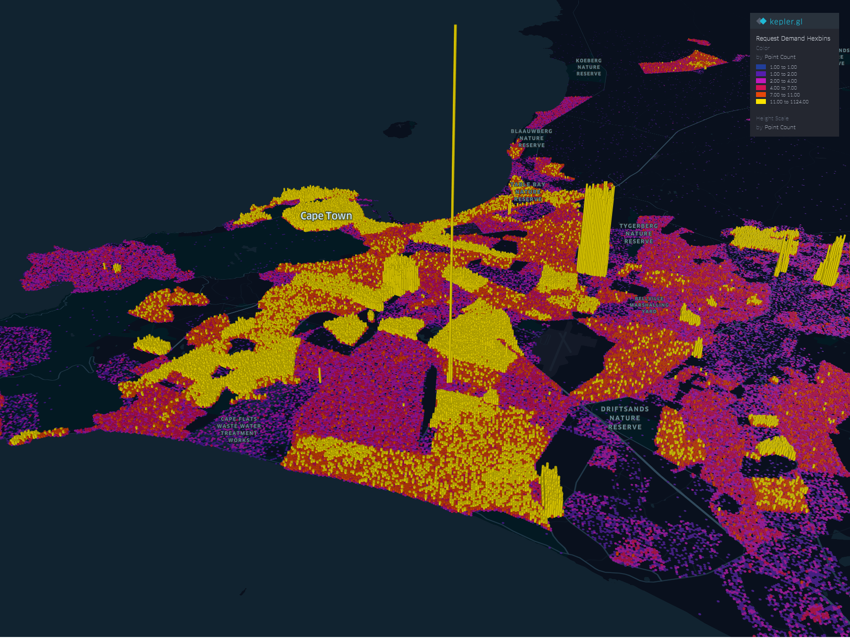
The areas with high service demand become apparent.- Samora Machel, Parow, Kraaifontein Area.
To explore the interactive visual follow this link.
2. The Busy Months
Human have this special ability to identify spatial patterns, couple that with time and we can identify patterns over time. By applying a time filter in Kepler.gl we can scroll through time and truly and get a glimpse of where and when requests activity is highest.
Follow this link to get to the visualisation. Zoom to FISANTEKRAAL - Top-Right quarter of the Map. I have set the ‘windows’ of time to one month and the speed of motion by 10.
You can zoom out to explore other areas, for instance
These questions can be answered with some SQL - but where is the eye candy in that?
These are just the few of the many questions one can answer in Kepler.
Punching Holes Into A Hypothesis
Getting the boundaries wrong ~ The power of map visualisations give one that extra dimensional look at the data. During the data cleaning and processing stage, 1. The Data - Service Requests, one primary aim was to have suburb names conform to a narrow set of names separately sourced. The knowledge of local geography revealed immediately that the definition of suburb ‘Athlone’ was skewed.
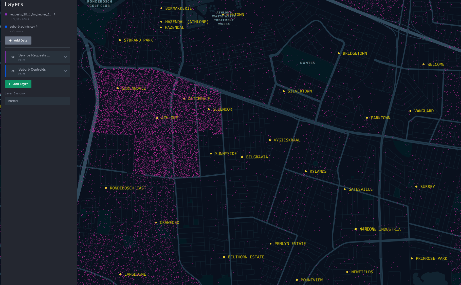
The short-stem ‘T’ cluster of points, to the right in the image, is Athlone as assigned in the dataset. By the looks of it though and local knowledge, the suburbs, yellow labels in the image all belong to Athlone (except the bottom-left quadrant). This then would require a revisit of the methodology when the ‘random’ points where generated.
A similar pattern is revealed for Khayelitsha. All the places of the ‘hanging-sack’, represent Khayelitsha and not just the slanted rectangular cluster of points.
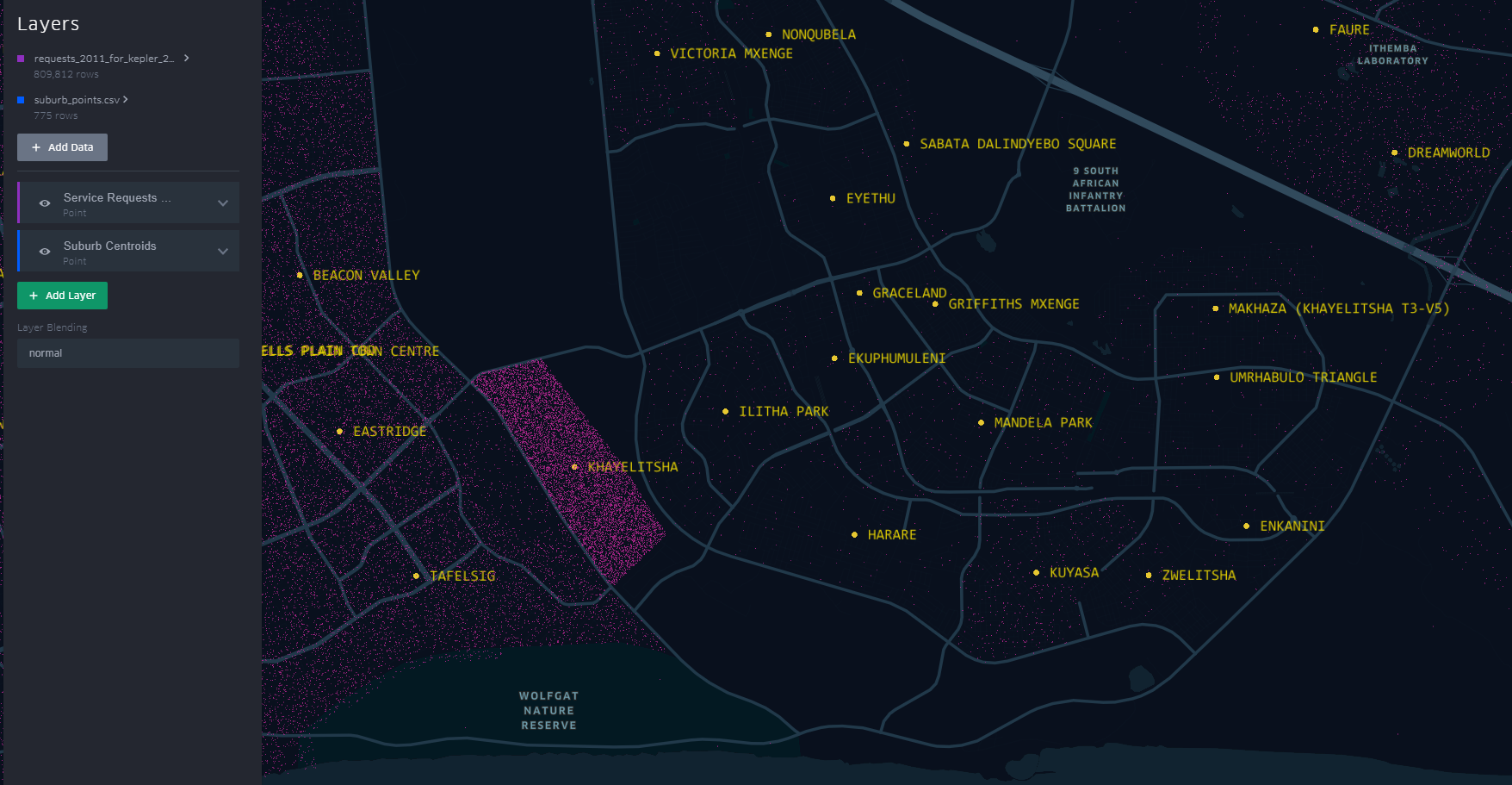
You can have a look at this scenario by opening the link here. Zoom to an area by scrolling the mouse wheel or ‘Double-Click’ for a better perspective.
This scenario becomes apparent when one turns on “Layer Blending” to additive in Kepler.gl
This is just a brief of how one can quickly explore data in a spatial context
#Postscript
I haven’t tried to visualise the data in any of the other ‘mapping’ softwares to see/ evaluate the best for this exercise.
25 Jul 2019
[A Data Science Doodle]
Shapes Meet Words
This stage is about bringing together the suburbs attribute data of 1. The Data and the spatial data from 2. The Data - Spatial.
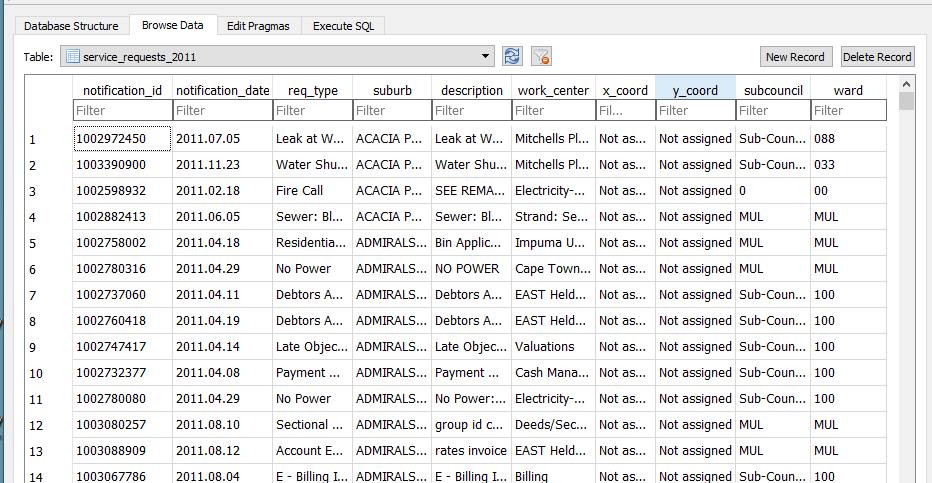
I imported the service_request_2011 data to the geopackage, the data types at this stage are all text and the relation looks thus
-
The fields subcouncil and wards are largely unpopulated and are deleted.
-
modified table in DB Browser for SQLite to reflect correct data type,
| Field Name |
Data Type |
| notification_id |
(big)int |
| notification_date |
date |
| req_type |
text |
| suburb* |
varchar80 |
| description |
text |
| work_center |
text |
| x_coord |
double |
| y_coord |
double |
Getting The Point
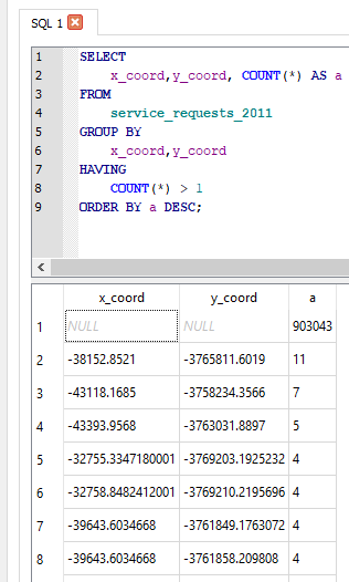
The service request each have an (x_coord, y_coord) pair. However the majority have not been assigned or most likely where assigned to the suburb centroid. So to check on the ‘stacked’ points I ran the query
SELECT
    x_coord,y_coord, COUNT(*) AS a
FROM
    service_requests_2011
GROUP BY
    x_coord,y_coord
HAVING
    COUNT(*) > 1
ORDER BY a DESC
The query revealed:
- Coordinates to be in metres (likely UTM).
- 903 043 records without coordinates.
- The highest repeated coordinate pairs being 11, 7, 5 and the rest 4 and below.
- 3127 records had unique pairs.[ COUNT(*) = 1 in the query above]
Now, identifying invalid x_coord and y_coord i.e coordinates not in the Southern Hemisphere, East of the Greenwich Meridian.
SELECT
    x_coord, COUNT(*) AS a
FROM
    service_requests_2011
WHERE x_coord >0;
(Query was repeated for y coordinate.).
For all the invalid and ‘out-of-place’ coordinate pairs, NULL was assigned.
UPDATE service_requests_2011
SET x_coord = null
WHERE x_coord = 'Not assigned';
(Query was repeated for y coordinate.).
Coming From ?
How Many Requests In This Area
As realised while exploring the service request data, most records did not have the (x, y) coordinate pair, yet consistently had suburb associated with them.
The next step was to assign a coordinate pair to each service request.
The following procedure was adopted.
- Count the records in each suburb (excluding suburb = INVALID). This resulted in a new table service_req_2011_suburb_count.
SELECT suburb, count(suburb) AS records
    FROM service_requests_2011
        WHERE suburb != 'INVALID'
    GROUP BY suburb
    ORDER BY records DESC;
For each of the 4 reference ‘suburb’ layers …
SELECT *
    FROM census_2011_sal AS a
    INNER JOIN service_req_2011_suburb_count AS b
     ON a.suburb = b.suburb
This is essentially a spatial query. ‘Show me all the suburbs from the census_2011_sal layer whose names appear in the *service_request_2011 data.*’ Executed and loaded in QGIS this looks like…
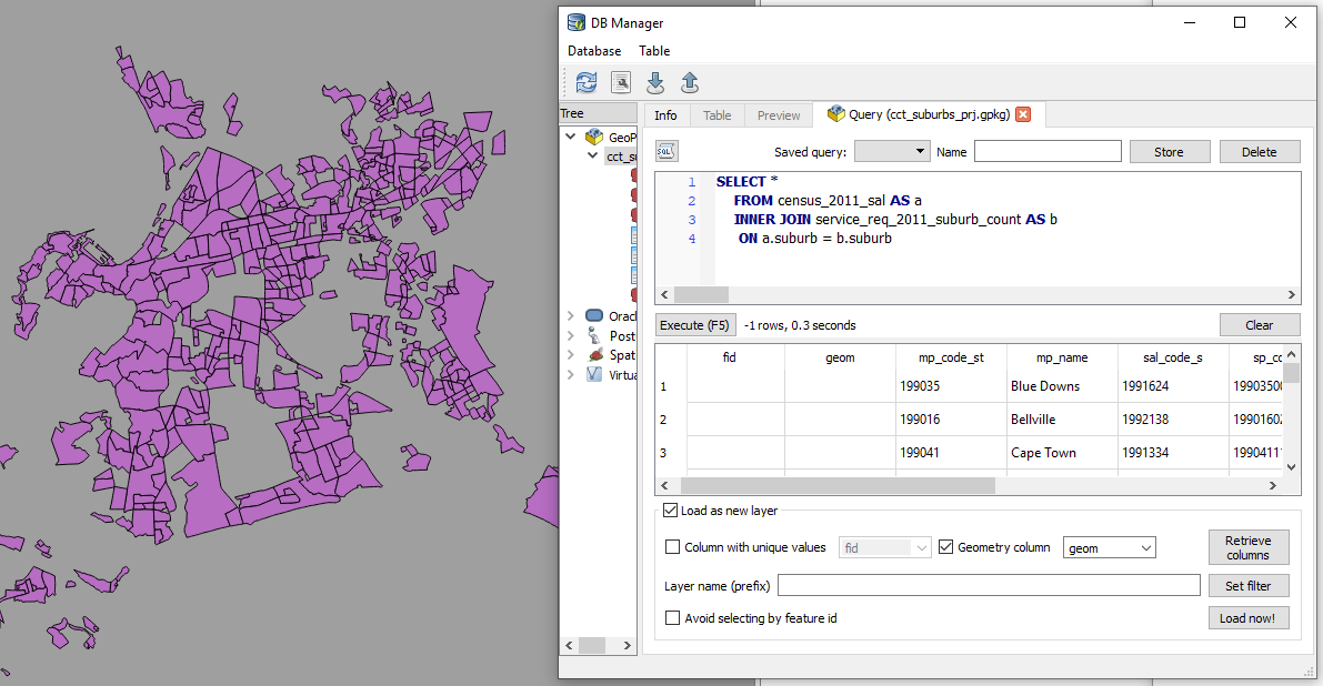
Saved the resultant layer as
census_2011_sal_a.
Now the subsequent query must exclude from the
service_req_2011_suburb_count all the suburbs already used by census_2011_sal (Why? Some suburbs names are repeated across data sets. This is an ANTI JOIN and one of its variations was adopted).
To get the remainder of the suburbs
SELECT a.suburb, a.records
    FROM service_req_2011_suburb_count AS a
        LEFT JOIN census_2011_sal_a AS b
          ON a.suburb = b.suburb
          WHERE b.suburb IS NULL;
The above query creates a new layer service_req_2011_suburb_count_a.
Now to get the matching suburbs from ofc_suburbs
SELECT *
    FROM ofc_suburbs AS a
    INNER JOIN service_req_2011_suburb_count_a AS b
     ON a.suburb = b.suburb
The results being a new layer, ofc_suburbs_a
Using the same procedure, I ended up with
-
census_2011_sal_a
-
ofc_suburbs_a
-
informal_areas_a
-
suburb_extra_a
which I combined to have one suburbs data layer suburbs with 775 records. This compound suburbs layer is a bit ‘dirty’ (overlapping areas) for some uses but for the current use case, perfect (each area is identifiable by name).
GeoCoding The Service Requests
From the initial investigation there were 3127 records which had a valid x,y coordinate pair. This set is about 0.3% of the entire set. I decided to ignore these and bunch them together with the rest of the unassigned records. Of the 906 500 records of service request, 96 688 have status of INVALID for the suburb, leaving 809 812 to be geocoded.
To geocode the service request, I chose the approach to have point for each service request and these appropriately dotted within a polygon.
A Scatter of Points
Step 1 was to generate random points within each suburb corresponding to the number of requests in it. This is accessible in QGIS.
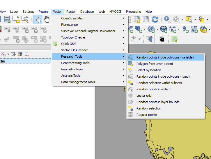
I call this “points scattering.”
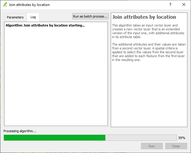
The next step was to assign suburbs to these points i.e. join attributes by location.
Exported the data to geopackage as service_request_points_a with 809 812 points.
So I could do some advanced sql queries on the data. I loaded the data to PostGIS with EPSG 4326.
I then ended up with a set of points, 809 812, which were supposed to have appropriate notification_ids associated with them.
Geography to Requests
Getting the generate points to have notification ids proved to be a challenge. (Revealing a knowledge gap in my skillset). I resorted to tweeter without success.
I decided to ‘brute-force’ the stage for progress’ sake with the intention of reviewing this at a later stage.
So I sorted the service_request_2011 data by suburb, then exported the result (notification_id, suburb) to csv.
SELECT notification_id, suburb from service_requests_2011
WHERE suburb != 'INVALID'
ORDER BY suburb ASC;
The sorting procedure was repeated for notifification_points_no_ids (the random spatial points data created in A Scatter of Points .), exporting (fid, suburb) to csv.
In a spreadsheet program (LibreOpenCalc), I opened the two csv files, pasted the fields side by side (the suburbs aligned well since they were sorted in alphabetical order). The resultant table, with fields - notificaion_id and fid, was exported as csv, reimported into the database as a table.
To get the geocoded service_requests_2011
-- Assign ids of spatial points to service requests ---
CREATE TABLE requests_2011_with_ids AS
SELECT a.*, b.fid
 FROM requests_2011 as a
 JOIN requests_notif_id_points_ids as b
 ON a.notification_id = b.notification_id;

--- Attach service requests to the points ---
CREATE TABLE requests_2011_geocoded AS
SELECT b.*, a.geom
 FROM requests_points as a
 JOIN requests_2011_with_ids as b
 ON a.fid = b.fid;
Next up…some eye candy! With a purpose.
#Postscript
-
Here’s the GeoPackage (Caution! 382MB file) with all the data up to this stage.
-
Using each of the ‘suburbs’ layers used, I created centroids - this can be used later for labelling a cluster of points to get context.
-
While generating points in polygon based on count, the QGIS tool bombed out at a stage. I iteratively ran the tool (taking groups of suburb polygons at a time) to isolate the problem polygon - JOE SLOVO (LANGA).I then manually edited the polygon, then generated the points for it. This error made me question the validity checking procedure I had performed on the data. Add to that, doing an intersect using data in a geographic coordinate system led to unexpected results - Q warns on this beforehand. One scenario was having more than the specified number of random points generated per polygon, e.g. 18 instead of a specified 6. (With the algorithm reading the value from attribute of the data.)
-
Running the spatial queries in the GUI (QGIS) took considerable time due to the sheer number of records. Intersecting the points and the polygons can be improved, taking a tip by Paul Ramsey from here for speed, with the data in PostGIS.
-- CHANGE STORAGE TYPE --
ALTER TABLE suburbs
 ALTER COLUMN geom
 SET STORAGE EXTERNAL;

--Force COLUMN TO REWRITE--
UPDATE suburbs
 SET geom = ST_SetSRID(geom, 4326)

--Create a new table of points with the correct suburbs--
CREATE TABLE points_with_suburbs AS
SELECT *
 FROM suburbs a
 JOIN points_in_polygons b
 ON ST_Intersects(a.geom, b.geom)

